Learning Digital Drawing - Portrait Study With Gray Value [Eng-Esp]
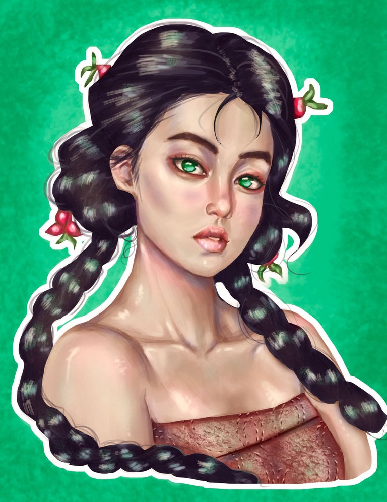
Hello friends, today I want to show you this portrait study that I have done in grayscale and then I have returned to colors, in this study I focus a lot on understanding the hard edges and brightness of the skin, then the images of the process.
Hola amigos, el dia de hoy os quiero mostrar este estudio de retrato que he realizado en escala de grises y luego he vuelto a colores, en este estudio me enfoque mucho en comprender los bordes duros y brillos de la piel, a continuacion las imagenes del proceso.
Process 📝 Proceso
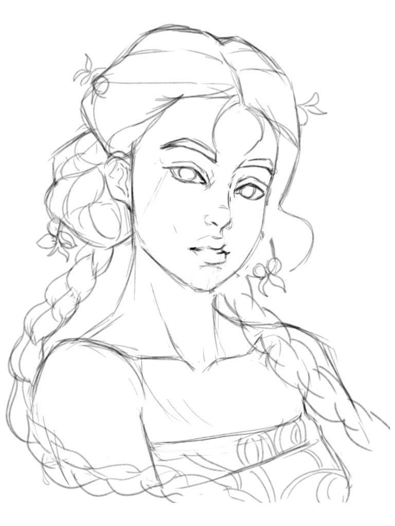
For the sketch I started directly defining the final line since lately I feel in very good shape and I really like the speed I've had in the line these weeks, I hope I don't forget everything in two days; Finally, to complete the sketch, add some modifications with the liquify tool and proceed to fill in grayscale.
Para el boceto empece directamente definiendo la linea final ya que ultimamente me siento en muy buena forma y me gusta mucho la velocidad que he tenido en el trazo estas semanas, espero que no se me olvide todo en dos dias; por ultimo para completar el boceto agregue algunas modificaciones con la herramienta licuar y procedi a rellenar en escala de grises.
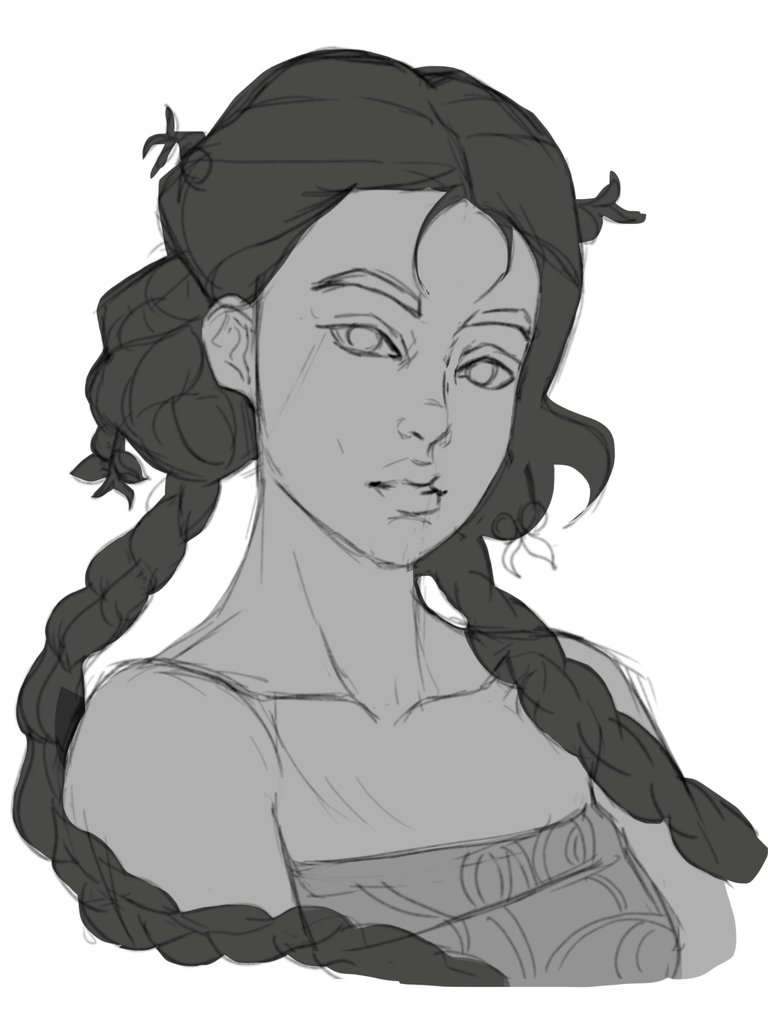
I am aware that in terms of painting clothes and hair I still have a long way to go to reach a level that I like, but first I want to concentrate on doing one thing well and that is the skin to which I dedicate almost all the time of this study, in which my main objective is to improve the understanding of the edges to give a little realism, after having the values established, I proceeded to place the colors guiding myself from the reference.
Estoy conciente de que en cuanto a pintura de ropas y cabellos me falta mucho para tener un nivel que me guste pero primero quiero concentrarme en hacer bien una cosa y eso es la piel a la cual le dedique casi todo el tiempo de este estudio, en el cual mi principal objetivo es mejorar en comprension de los bordes para dar un poco de realismo, luego de tener los valores establecido procedi a colocar los colores guiandome de la referencia.

To finish this study I decided to add a background with a color that would contrast with the painting and also add various details such as brightness and color nuances, also increasing the saturation and contrast; and that was all for this study, thanks for seeing my work and see you in the next post bye
Para terminar este estudio decidi agregar un fondo con un color que hiciese contraste con la pintura y tambien agregue varios detalles como brillos y matices de colores, aumentando tambien la saturacion y contraste; y eso fue todo por este estudio, gracias por ver mi trabajo y nos vemos en el siguiente post chau
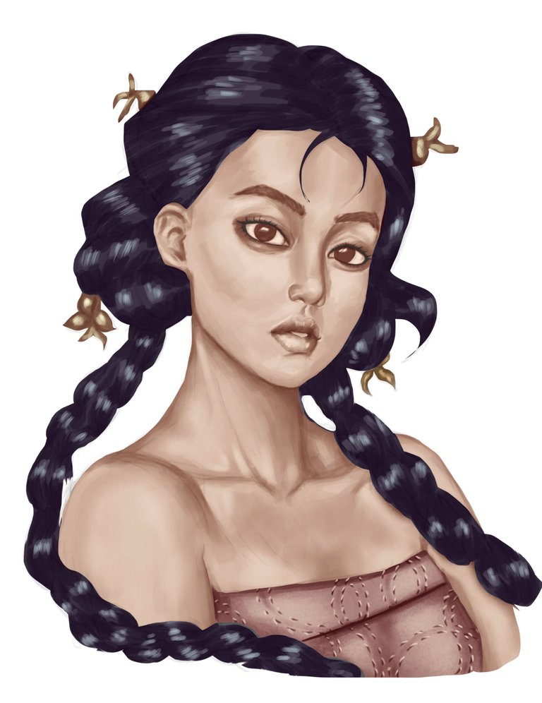
Reference image 👥 Imagen de Referencia
Social media


Thank you very much for viewing this post, see you next time 😄 Muchas Gracias por visitar este post, nos vemos la próxima.
0
0
0.000
Muchas gracias por el apoyo 🙏