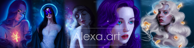
I think I accidentally drew Selena Gomez

Good evening, everyone. Today I wanted to draw, and although I didn't have a clear idea at first and this drawing underwent quite a few changes, I managed to finish it. But then I realized that the face looked familiar and reminded me a lot of a young Selena Gomez, ha ha ha. And believe me, I'm not a fan of Selena, so realizing this was a little humiliating for me. I'm not saying she's identical, but she does look quite similar, ha ha ha.

My main idea was different, but honestly, it didn't turn out the way I wanted it to, so I ended up taking a different direction later on. For now, I'll tell you that I made the sketch and started working with grayscale, adding lights, shadows, and improving each layer by blending the tones to create a more realistic skin tone. Then I painted the dress. For this, I didn't really use many colors, just a dark gray and a slight shadow with black to give volume to the breast area.

I imagined my drawing in grayscale with a touch of color that would stand out and be the focal point. I tried it, but it didn't look right, so I decided to put this touch of color in the background. I liked it a lot, but I didn't like how the gray tones looked combined with the background, so I decided to give my character a dark/bluish tone. This way, it was more pleasing to the eye. I also painted the hair, and to be honest, I forgot to paint the highlights that usually give it shape and volume. Even so, I think that oversight was a good thing because the hair looks pretty good despite everything. I finished by adding highlights to areas of the face that I wanted to emphasize.

Tools:
- Photoshop CC 2022
- XP-PEN Deco Pro
Herramientas:
- Photoshop CC 2022
- XP-PEN Deco Pro
i think you did but the younger version 😮 this is beautiful with all the blues in it tho 😮