Ragnarok Logo Contest - My 3° proposal

Hello everyone, with this article I propose my third proposal for the logo by participating in the contest @ragnarok.game
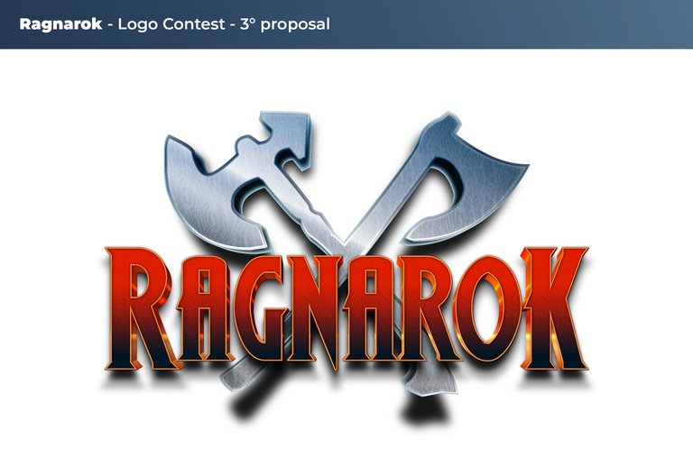
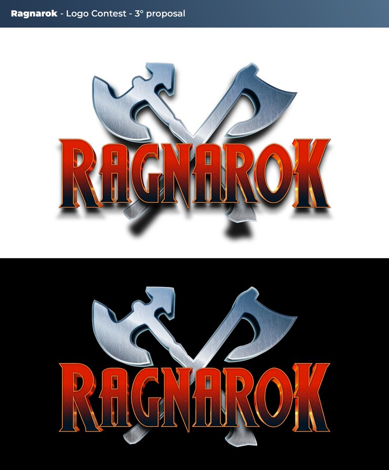
This logo unlike the previous ones (which you can see here FIRST and SECOND proposal) has a 3D effect, I used a very charming and aggressive font (Wolf's of bane II). This writing in my opinion is impressive, I decided the red color to increase the feeling of war, the two weapons on the metallic background obviously symbolize the battle.
Below you can see the logo on white background and black background.
I hope you like this job, I invite you to let me know your opinion in the comments.


Ciao a tutti, con questo articolo propongo la mia terza proposta per il logo che partecipa al contest di @ragnarok.game
Questo logo a differenza dei precedenti (che puoi vedere qui PRIMA e SECONDA proposta)ha un effetto 3D, ho utilizzato un carattere molto affascinante e aggressivo (Wolf's of bane II). Questa scritta a mio parere è imponente, ho deciso la colorazione rossa per aumentare la sensazione di guerra, le due a armi sullo sfondo di colore metallico, ovviamente simboleggiano la battaglia.
Qui si seguito puoi vedere il logo su sfondo bianco e su sfondo nero.
Spero che questo lavoro ti piaccia, ti invito a farmi sapere il tuo parere nei commenti.

Electronic-terrorism, voice to skull and neuro monitoring on Hive and Steem. You can ignore this, but your going to wish you didnt soon. This is happening whether you believe it or not. https://ecency.com/fyrstikken/@fairandbalanced/i-am-the-only-motherfucker-on-the-internet-pointing-to-a-direct-source-for-voice-to-skull-electronic-terrorism
https://twitter.com/Cecconigrafica/status/1486752551278104586
The rewards earned on this comment will go directly to the person sharing the post on Twitter as long as they are registered with @poshtoken. Sign up at https://hiveposh.com.
Per me questa è la piu bella delle tre!
!lol
!PGM
lolztoken.com
You are out of jokes for the day!
@stewie.wieno you can call @lolzbot a maximum of 4 times per day.
Level up by buying more $LOLZ so you can share more jokes per day!