Quirky | Type Design 🍁
I've been working on this typeface design for a while now and I've realized this one is not suitable for the digital medium, like any other font. I feel like this one is more context-appropriate and has a specific place like in an album cover or poster or something that's made and done. It's not a font actually. It feels more like art where I haven't found its place yet. But I love it so much that I keep working on it to perfect it.
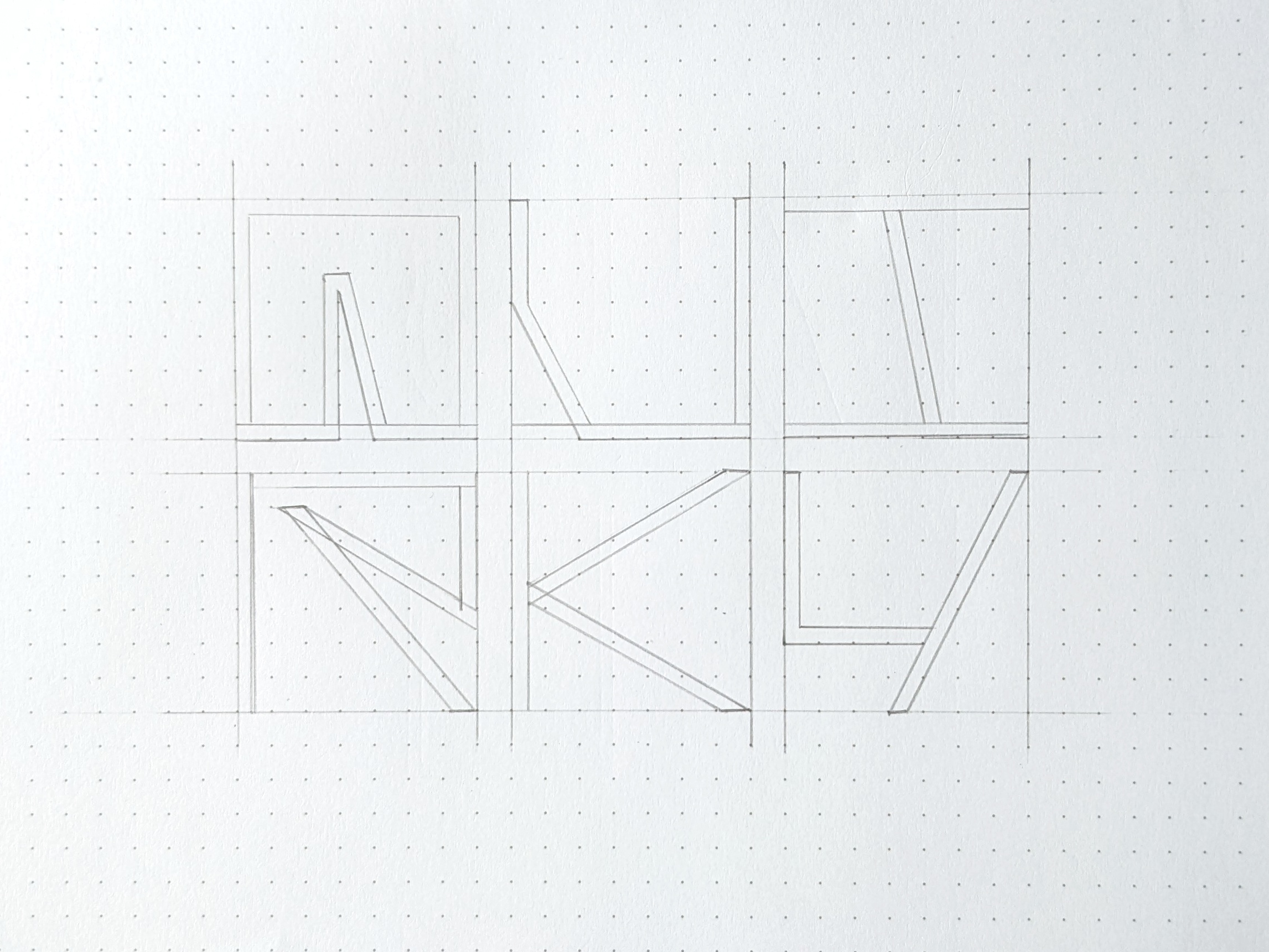
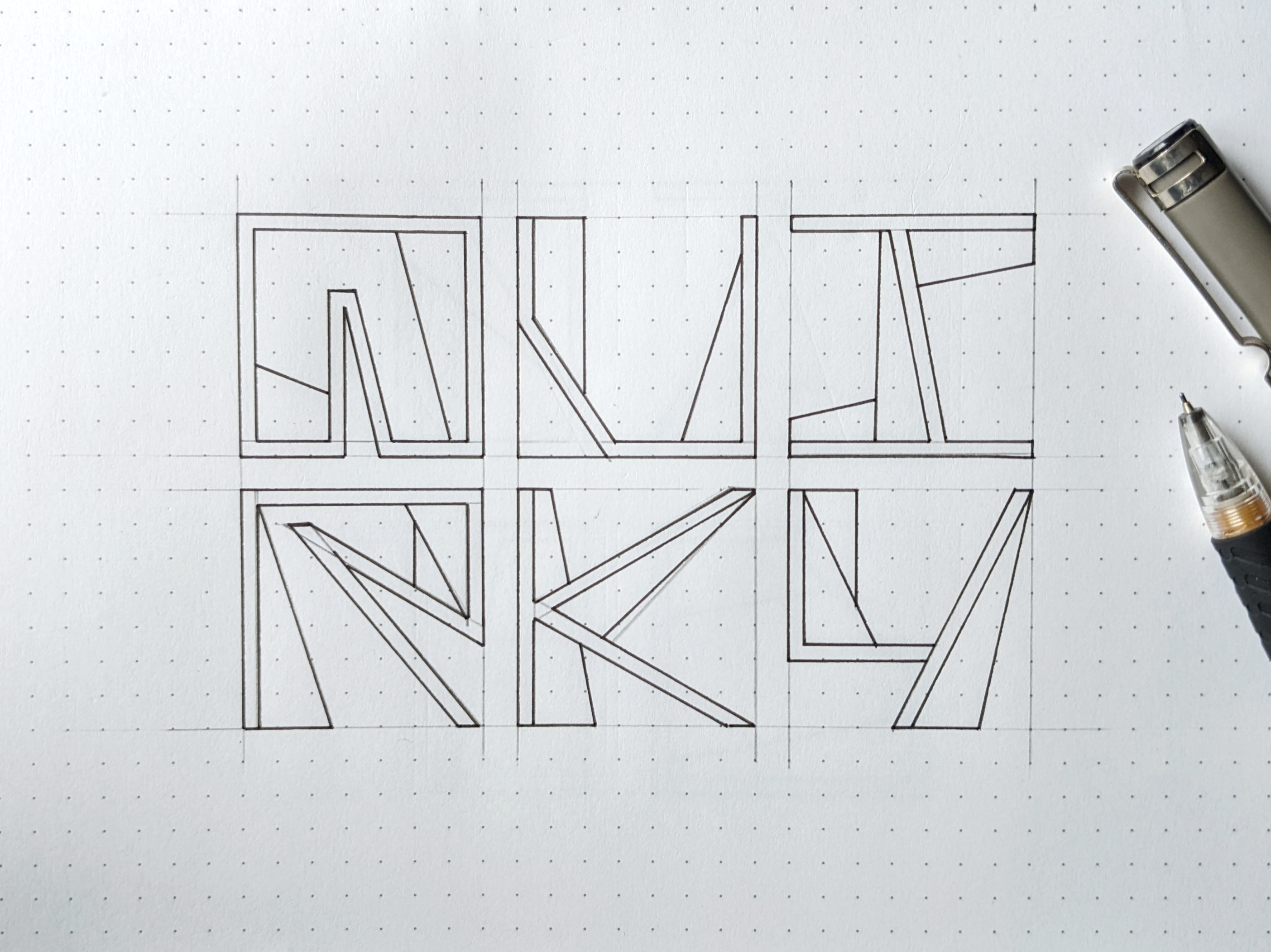
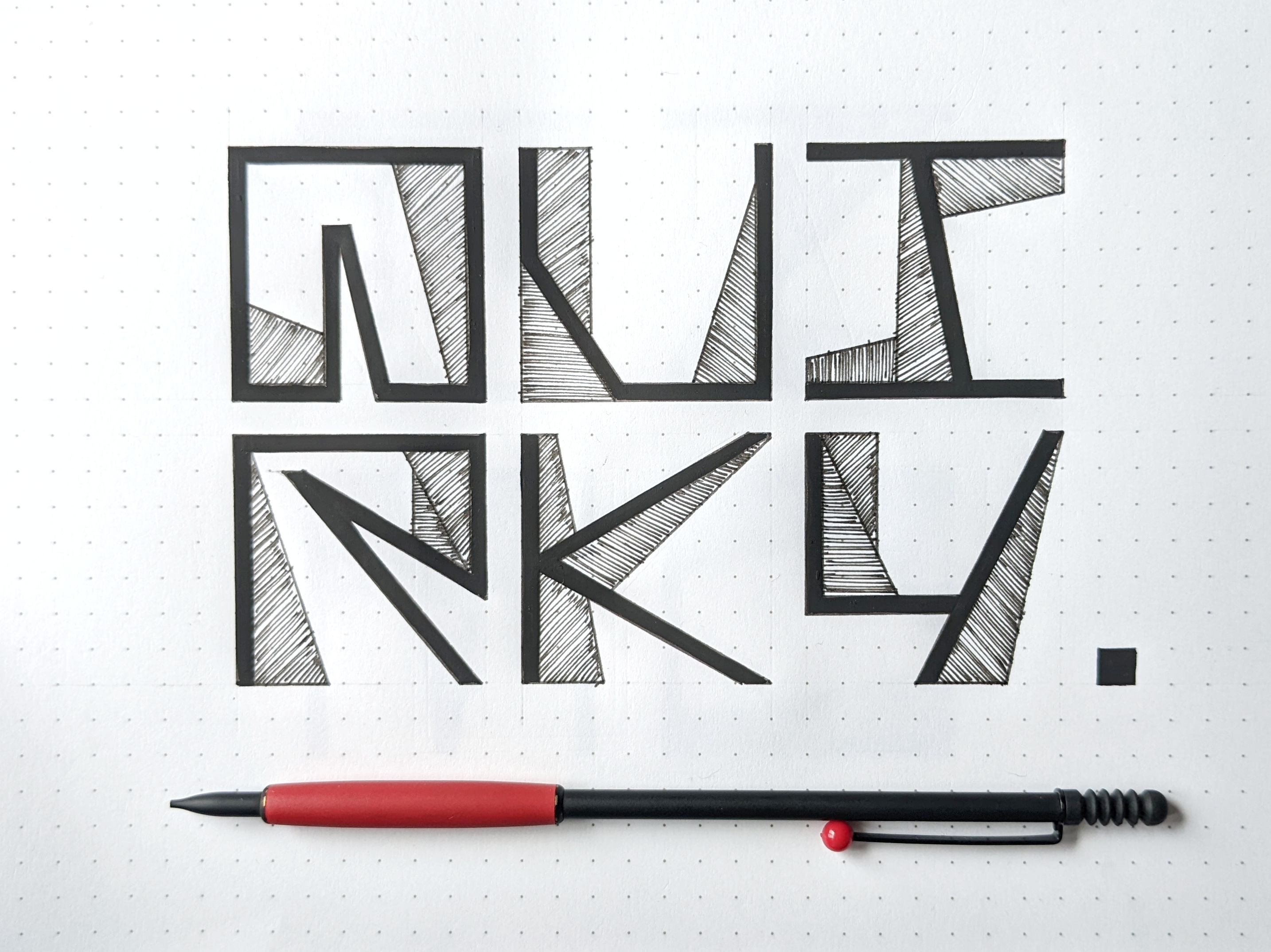
So today I thought I'd write 'Quirky' in this typeface because that's the adjective I'd describe it with. But I soon as I completed it I found so many places where it can be improved. Here, I think Q and R seem to be heavy in contrast to U, I, K, and Y. Inner negative spaces don't balance out. That's why the left side feels heavy and boxy to the right side. K and Y have many open sides so I don't think this one fits well together.
But that's why writing, again and again, is important for me. But it is definitely time-consuming. So I waste a whole lot of time in making that decision.
The Typeface
Your content has been voted as a part of Encouragement program. Keep up the good work!
Use Ecency daily to boost your growth on platform!
Support Ecency
Vote for new Proposal
Delegate HP and earn more
Thank you :)
Appreciate it.
Cool! I love it. Every letter is recognisable, even if there is possibility to mistake 'f' with 'p' or 'g' with handwritten 'a'. But I don't get letter 'q' at all. In no universe i would know it's q. Besides that very interesting font:)).
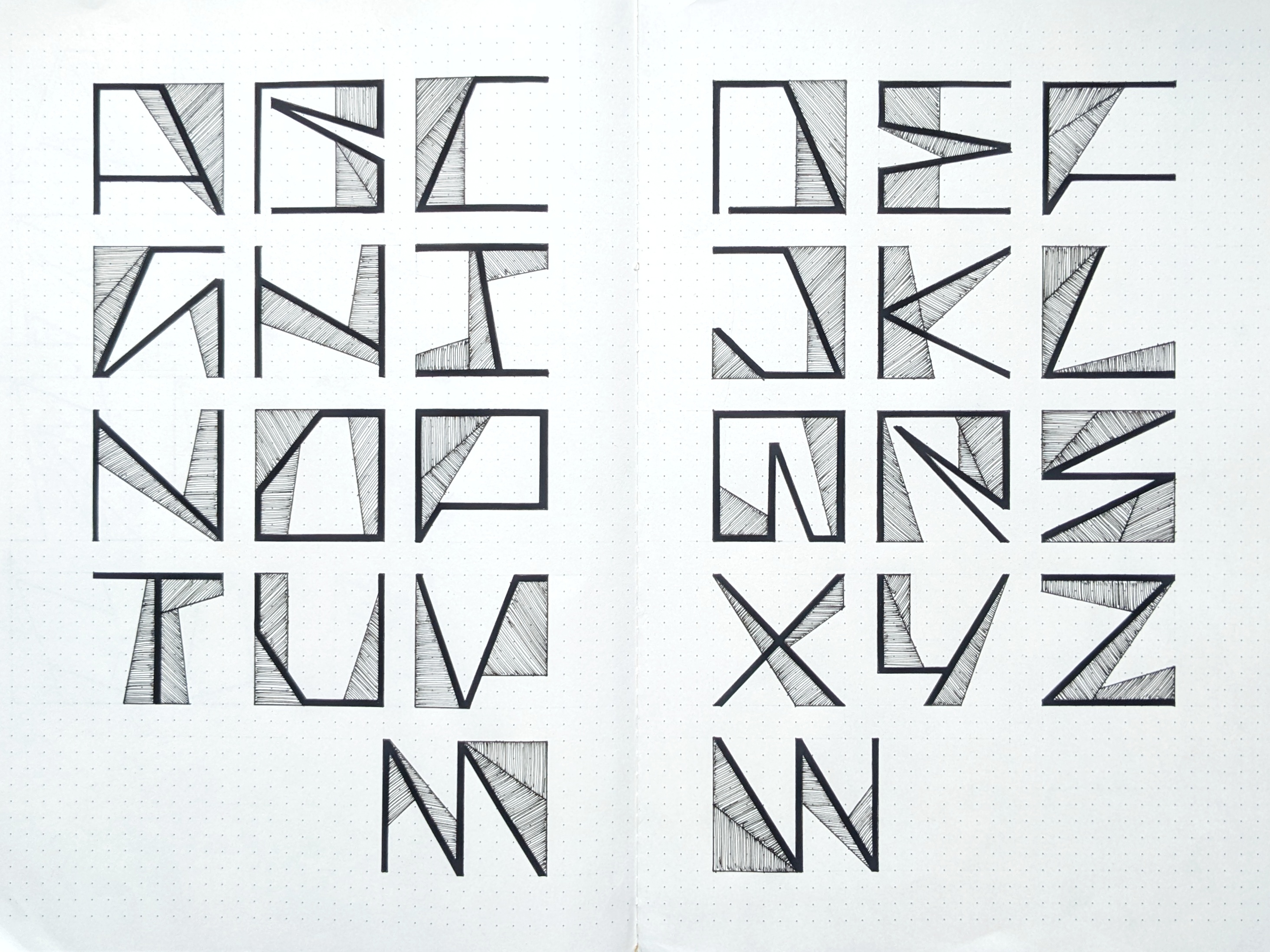
This 'Q' was an attempt to avoid its descender, the diagonal line. I was trying to fit the 'Q' in a square form.
Thanks for the feedback. Much appreciated :)