A quick SPS Chart before work... and the short term is mildly Bearish :(
Good morning Internet Friends!!
I wanted to take a quick look at the $SPS chart before work today... and I wish I could come to you and say I think things look AMAZING for this week and next...
But upon seeing several converging indicators... I suspect the Price Action (PA) on $SPS over the next week or two will be downward... 😩 le sad...

We saw that the Bitcoin ETF didn't immediately land us in "MoonLambo" Territory... but ultimately that should help in the long run...
However, as I have stated many times in the past... If I consider Bitcoin the Planet... Alts are the Moons and they'll "orbit" more extreme than Bitcoin (their price swings are greater)
So let's see if we can decipher what the charts are telling us:
"When in doubt, zoom out" - remember that Article I wrote? No? Click the Blue Link!
Our first chart is a "Zoomed Out" View of $SPS - SPS is the Governance Token of #Splinterlands (my favorite #web3, #play2earn game).
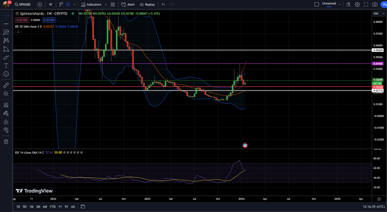
I have my Bollinger Bands turned on, I have some S/R Levels set at:
Low White: $.02176
Low Red: $.02503
High Green: $.03005 (we failed to stay above this S/R Level 😭)
High White: $.05609
The Purple Line is not a true "S/R Level"... but I find it VERY INTERESTING that the top of this run was at $.04472 and on the left there are two candles that drop pretty far...
The first candle in the bottom of the big dip, coming down from the Red Candle bottom... it drops to $.04451... and the BIG CANDLE coming down from the Green Candle bottom (right next to it)... drops to $.03087...
The Red candle wick drops to within $.00021 of the peak of this rally? Weird, right 🤔
The Green candle wick drops to within $.00082 of where I have the Green Support line set... WEIRD, RIGHT 🤔
Anyways... from this Weekly Timeframe chart, you can see a few things happening:
- We failed to maintain the $.03 S/R Level
- The Parabolic Advance was broken (Red lines at weird angles)
- We aren't showing much strength and the overall market seems to be stagnant
- The Mid Bollinger Band is at $.02176 which lines up with my "Low Support Level" White Line...

Interesting note - I have drawn my Low White Support Line at $.02176 but there is one other possibility...
The bottom of the previous support could possibly be the support level I should have drawn... but we will see...


You see the thin Red Lines, seemingly drawn at random angles?
There's some Mumbo Jumbo (sorry @azircon I needed to use some MJ this week) about drawing lines from the corner of one Candle to another and as they DECREASE in ANGLE this means the price is RISING FASTER...
Eventually, this becomes unsustainable (duh) and the price will crash, settling at a "Mean" price - typically above where it started but significantly lower than the top where it "finished"...
Once the thin Red Lines no longer have an "Decreasing Angle"... They have "Broken" the "Parabolic Advance" - if you draw a Parabola you'll see why it's called a Parabolic Advance (I can't draw a Parabola in MS Paint, sorry).
After the Parabolic Advance is broken, the price will start fluctuating and then dropping... RAPIDLY.
Each thin Red Line then becomes another opportunity to close above it... thus resuming the Parabolic Advance...
Should the price fail to close above the thin Red Line from the PAdv... then that will become a "sticking point"... not quite resistance... but kinda-sorta... there's more of that Mumbo Jumbo... anyways... go look for yourself!!
NOTICE HOW EACH RED LINE GETS A "TOUCH" BY THE CANDLE WICK AFTER IT BREAKS BUT THE PRICE DOESN'T GO ABOVE IT!!! WEIRD, RIGHT!!!!
NOTICE HOW RIGHT BEFORE THE FINAL PAdv LINE IS BROKEN, THE PRICE DROPS RIGHT TO THE FINAL PAdv LINE BUT COMES BACK UP... BEFORE FAILING... WEIRD, RIGHT????!!!!

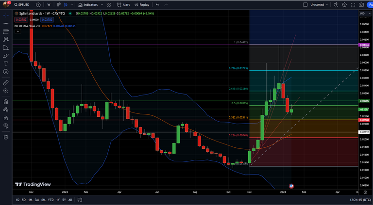
The .382 Level on the Fibonacci Retracement (Orange), lines up with the $.025 price point Low Red Support Level... Again.
In addition, on the Daily Chart... the Low Bollinger Band (created by analyst John Bollinger) suggests the Low Price Range should also be around the $.025 Level...
aaaaaaaaaaaaaaaaaaaaaaaaaaand... The Low FibRet Level of .236 (I don't use much) is ALSO lining up with the $.02 Level 😭
Of course!!! There's a LOT of GOOD NEWS!!
- I believe this to be a temporary dip (I'm adding to my bags)
- I think the Bull Market doesn't truly start until Dec 24-Jan 25!!
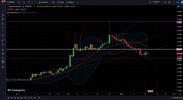
- There is one slightly positive indicator for us... The Daily RSI!
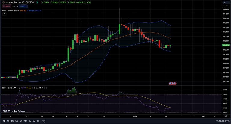
An "Oversold" RSI is typically a pretty solid "Buy" indicator for me! Especially on the Higher Timeframe Charts:
Daily = Good
Weekly = Great
Monthly = OMG
With the RSI near Oversold territory and the Low Bollinger at $.025 along with many other tools... I think we are near the bottom of this consolidation move... (I hope)...
I'll leave this up to look back on at a later date... Whether it be for Glory or Shame... Only time will tell!!!
Thank you for joining me, that's all I have today and now I have to head to work!!
I hope you found this chart informative and I will do my best to post another one soon!!
Depending on whether or not I make a Splinterlands post, that may use my free writing time for the day... But I promise, I will definitely be back!!
This post and none of my other posts are financial advice. I am not telling anyone to purchase/hold/sell or invest in any asset. What you do with your own money is up to you... my posts are just my observations and opinions!
If you liked it: please follow me and reblog for visibility!!
I appreciate the support and it definitely encourages me to share more of these along with my experience - an entire DECADE of it, in the Crypto world!
Please let me know what you think, any charts or topics you'd like to see and how I can improve in the comments below!
I look forward to reading them and if you decide to follow me, please say so in the comments so I can follow you back 😄
Cheers 🍻,
- CaptainDingus

#LeoFinance #Finance #Chart #TechnicalAnalysis #PriceAction #Bitcoin #Crypto #HiveFinance #Hive
Congratulations @captaindingus! You have completed the following achievement on the Hive blockchain And have been rewarded with New badge(s)
Your next target is to reach 1000 upvotes.
Your next payout target is 1000 HP.
The unit is Hive Power equivalent because post and comment rewards can be split into HP and HBD
You can view your badges on your board and compare yourself to others in the Ranking
If you no longer want to receive notifications, reply to this comment with the word
STOP