WRITING MY YOUNGER BROTHER'S NAME ON HIS CERTIFICATE WITH VERY PRECISION

Hello Hive Learners, how are you today ?, i hope everyone doing good and Happy Sunday for all of you

Hello everyone, happy Sunday to all of you. As usual, on Sundays we will make Sunday Creative posts, where on Sunday Creative we will make various kinds of posts about any kind of creativity, be it art, cooking, or other handicrafts. As usual, this time I will also make a post about art as my Sunday Creative post and this time I will make something different from before.

This time it happened that my younger brother won a musical poetry competition at her school, and as a prize she was given a trophy and a certificate. The certificate given does not have a name written on it, in the sense that we have to write our own name on the certificate sheet. Indeed, for small competitions at the school level, the school usually rewards the children who win the competition with a certificate with no name written on it. I also received certificates like this when I was in school and of course I wrote my own name on the certificate my. And this time, I will show you the process when I write my younger brother's name on the certificate, this is tricky, and because I don't have a special calligraphy pen, I try to write it well using makeshift tools, so let's check this out.

Before starting, here I use several tools such as pens, sharp pencils and erasers, and of course I use the ruler only to make guide lines.

I'll start with the guideline, because I don't want the writing to shift sideways and not be parallel, so I need this guideline as a path and also the vertical and horizontal boundaries. I have to measure so that the writing is right in the middle of the paper, so I use a ruler.
I haven't made this since I was in school and I think my hands have lost some dexterity on this one, and since it's a certificate, of course I can't make mistakes and I have to make the most of my pencil before I use my pen. Maybe when I draw, if the mistakes can't be corrected, I might be able to replace it with new paper and throw away the old one, but not with this certificate.

And here it is, I'll start with the first letter. Here I will use two types of writing styles, for the initial letters I will use the Old English Text writing style, and for the others I will use the normal Letter writing style. If I use uppercase letters with a letter style, of course it will require a larger space because the letter writing style is actually very complicated and the decoration is very difficult. Meanwhile, the Old English Text writing style is not too large and is suitable for the first letter, and does not require a large space.

After I made the outline, I added volume to the letters and decorations and it looks like in the photo. Actually, to make Old English Text type writing, we just need to use a Parallel Pen with a size of 0.2mm to make work easier, but unfortunately I've lost my Parallel Pen for a long time, and now I only use regular pencils and pens to make it.
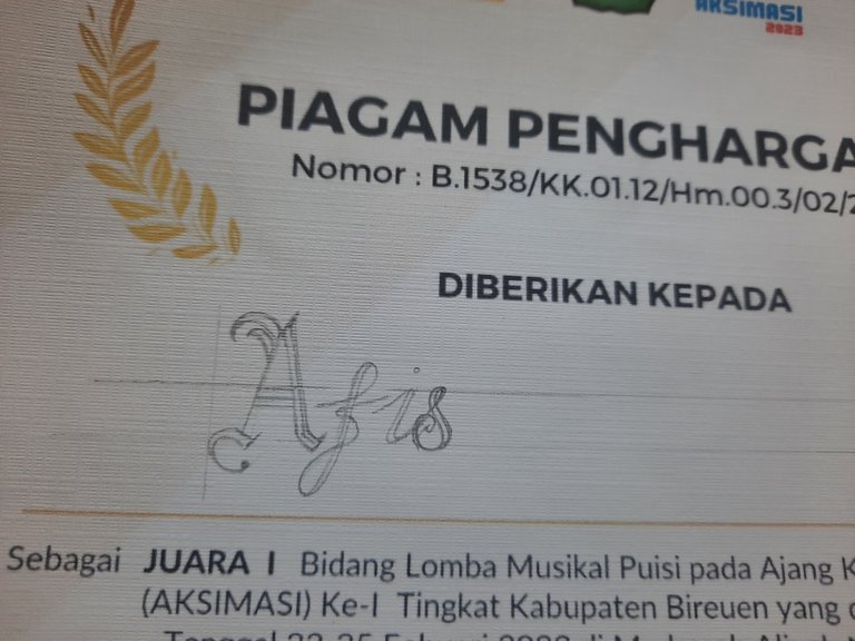

After a long process with the capital letters, I continued to lowercase letters in the Letter style. Even so, this writing is very tricky and in my opinion it is more difficult than writing the Old English Text. Usually professional Calligraphy writers use Fountain Pens to write this writing more easily.
After writing it with a pencil, I immediately bolded and colored it with my pen, in the whole process I had to prepare the words for the whole name.

And here comes the hardest part...
Here I will make two words that are the same and with the same writing and of course I don't have tools to copy the writing to make the second writing easier. And in this case, precision is very important. If you make something like this, you have to be very careful and use a pencil as best you can because pencils can still be erased. I of course measure every curve of the letters, the height of the main letters, and the distance between the letters, and things like this really test patience and caution.
A little mistake is fatal, it will ruin everything.

I'm entering the coloring process, this is where I have to be more careful than before, of course during this process my hands shouldn't shake a bit, the longer you color it, the greater the risk of mistakes, therefore when using a pen I have to work fast and that's why I sketched it with a pencil first.

Here's the end result...
I have to wait for the pen ink to dry and after that I just have to erase the guidelines that I made the first time.

After erasing the guide lines and this is the final looks. Looks awesome isn't it ?

That's the whole process of writing the name on my younger brother's certificate as my Sunday Creative post this time, hope you guys like it and see you on next week's Creative Sunday post.
This looks like it's a computer that wrote it
Nice one
Thanks a lot buddy, i'm very appreciate it. 👍
You're welcome buddy ❤️
😊 Nice idea and beautiful font, I'm sure he will appreciate it.
I hope so, thanks a lot mate...👍
You did well. This is so creative
Thanks a lot mate.👍
Your precision is impeccable
Thank you very much buddy, i'm glad you like it. 👍
Was this done manually or using a computer?
It looks like a computer for real.
Of course it's manually writing mate...👍