My confrontation with color and B&W photography [ENG/PL]
Hi!
While browsing the communities founded in hive, I found this one. I was interested in the combination of color photography with B&W. The cool thing is that you can compare them this way.
Although I rarely edit my photos for the B&W version, out of curiosity I decided to choose a few of them and make a comparison.
Cześć!
Przeglądając społeczności założone w hive trafiłem na tę. Zainteresowało mnie te połączenie fotografii kolorowej z B&W. Fajne jest to, że można w ten sposób porównać je ze sobą.
Choć sam rzadko obrabiam swoje zdjęcia do wersji B&W to z ciekawości postanowiłem wybrać kilka z nich i zrobić porównanie.
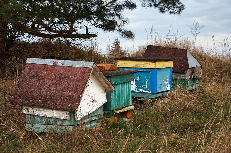
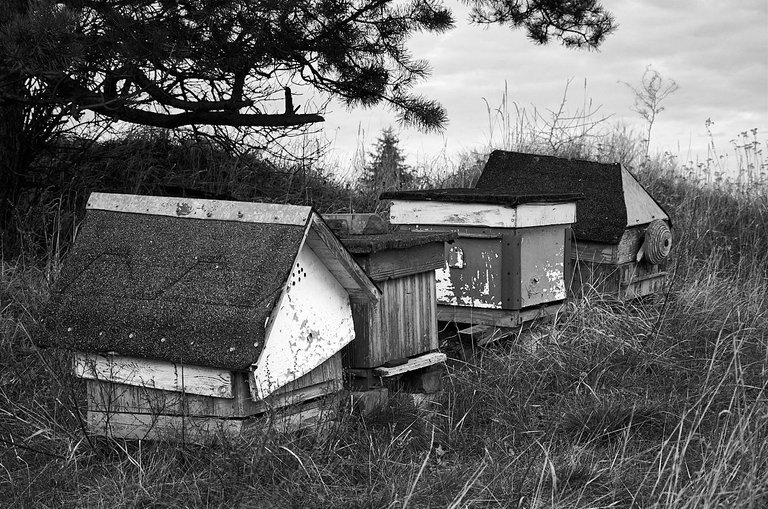
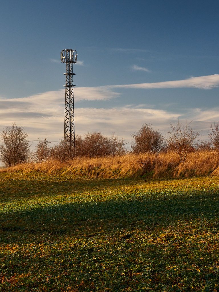
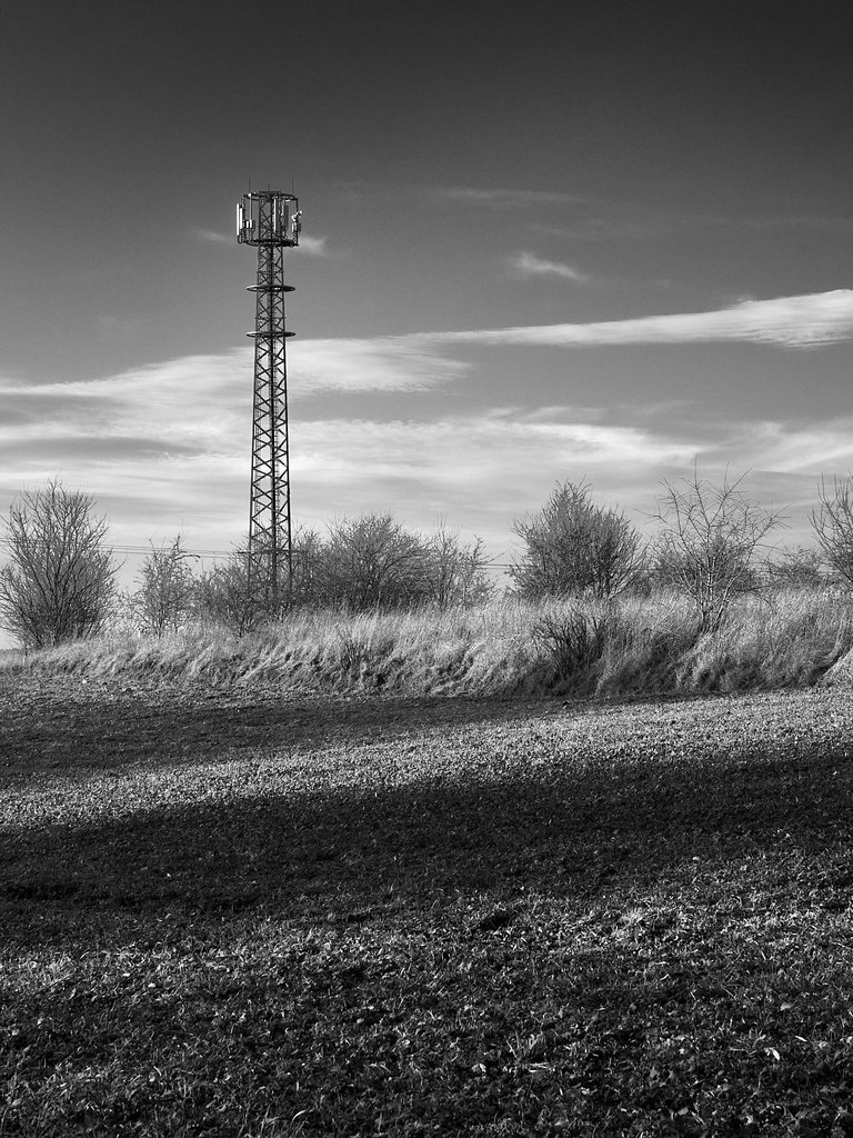
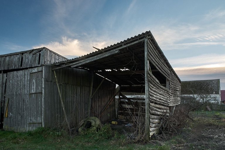
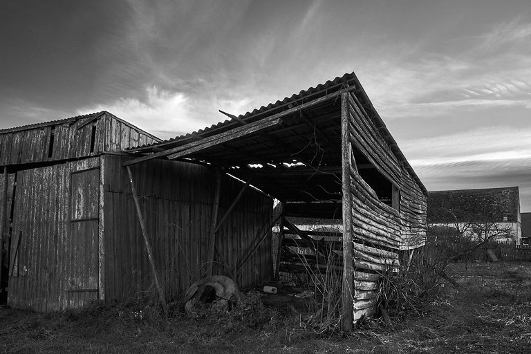
At the beginning, for the confrontation of colors with B&W, I chose two photos (those above and below) that I took on a walk because of the colors.
Na początek do konfrontacji kolorów z B&W wybrałem dwa zdjęcia (te powyżej i poniżej), które zrobiłem na spacerze ze względu na kolory.
However, the photo below, due to the decaying wooden shelter, in my opinion immediately more suited to the B&W version.
Natomiast poniższe zdjęcie ze względu na rozpadającą się drewnianą wiatę według mnie od razu bardziej pasowało do wersji B&W.
All in all, it was an interesting and fun experience, and I think I'll be working on more photos for the B&W version one day.
Thank you in advance for any likes and comments.
W sumie było to ciekawe i fajne doświadczenie i chyba jeszcze kiedyś obrobię kolejne zdjęcia do wersji B&W.
Z góry dziękuję za ewentualne polubienia i komentarze.