Dibujando con colores pasteles | Drawing with pastel colors [ESP-ENG]
Hola a todos mis lectores! Espero se encuentren muy bien, el día de hoy les comparto mi experiencia usando estos colores de madera en bonitos tonos pasteles y que pude adquirir hace poco además desde ya les digo que son excelentes en tanto intensidad de color y dureza de la punta del lápiz además de ser bastante variados, como podrán ver este dibujo lo realice únicamente con estos colores y combinándolos entre si. Espero les guste y los invito a leerme! 💗✨
Hello to all my readers! I hope you are very well, today I share with you my experience using these wood colors in beautiful pastel shades and that I could acquire recently and I tell you that they are excellent in both intensity of color and hardness of pencil tip besides being quite varied, as you can see this drawing was made only with these colors and combining them with each other. I hope you like it and I invite you to read me! 💗✨

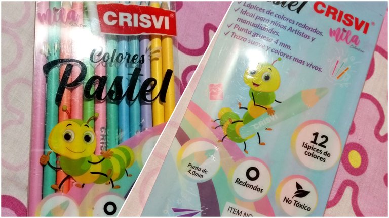
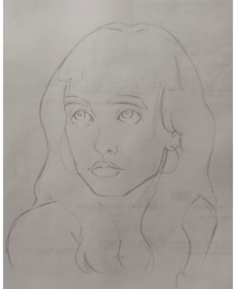
- Lo que utilice para realizar el dibujo en tradicional en una hoja tipo cartulina tamaño 35 x 28 cm, un lápiz de grafito 2 HB y un borrador (corté mi borrador haciendo que las esquinas quedarán en punta así será más fácil borrar espacios pequeños), mis colores pasteles, corrector líquido blanco y un lapicero negro.
- What I used to make the drawing in traditional on a cardboard type sheet size 35 x 28 cm, a graphite pencil 2 HB and an eraser (I cut my eraser making the corners to be pointed so it will be easier to erase small spaces), my pastel colors, white liquid corrector and a black pen.

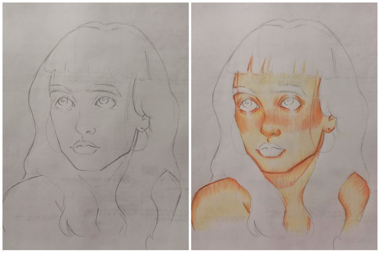
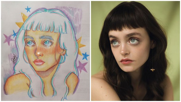
Para este dibujo tome de referencia una retrato de pinterest de una mujer, comencé a hacer el boceto con lápiz y luego comencé a usar los colores pasteles. Comencé usando un amarillo pastel y con el fui haciendo la primera capa del tono de piel, luego con un color salmón fui haciendo tanto el rubor como delinear varias zonas del rostro. Estos colores me gustaron mucho al usarlos ya que son bastantes suaves de combinar y los tonos pasteles se notan intensamente, son muy bonitos.
For this drawing I took as a reference a pinterest portrait of a woman, I started to make the sketch with pencil and then I started to use pastel colors. I started using a pastel yellow and with it I was making the first layer of the skin tone, then with a salmon color I was making both the blush and outline several areas of the face. I really liked using these colors because they are very soft to combine and the pastel tones are very intense, they are very pretty.
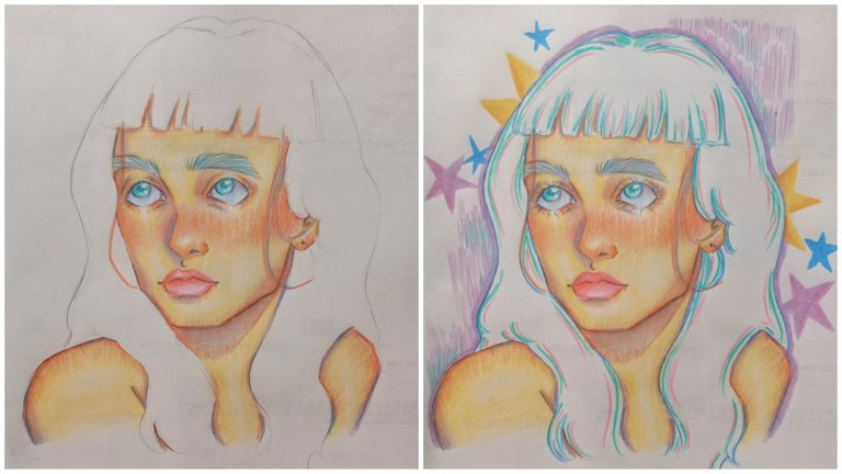
Para hacer las sombras use un color lila y un azul claro y poco a poco las fui construyendo y uniendo a los colores que ya había agregado, con azul cielo pinte sus ojos y con rosa agregué un poco de detalle en ellos para que no se vieran totalmente azules, con azul de un tono un poco más oscuro fui detallando lugares donde predominaba la sombra como el orificio de su nariz, delinear sus ojos y hacer los detalles en sus cejas. Con un tono salmón y rosa pinte sus labios y con turquesa pinté sus irises. Ya teniendo casi el dibujo terminado comencé a delinear toda la línea del cabello y luego use diferentes colores para darle más contraste a el blanco del fondo, para dibujar alrededor del dibujo principal hice algunas estrellas y líneas además de delinear todo el dibujo con color lila. A pesar de que no estaba convencida con el nombre de la marca de estos colores, ya que estoy un poco familiarizada con las marcas de aquí y ésta se ve como una marca nueva, me encantó la composición y la forma de colorear con estos colores.
To make the shadows I used a lilac color and a light blue and little by little I built them up and joined them to the colors I had already added, with sky blue I painted her eyes and with pink I added a little detail in them so they didn't look totally blue, with blue of a slightly darker tone I went detailing places where the shadow was predominant like the hole of her nose, outlining her eyes and making the details in her eyebrows. With a salmon and pink tone I painted her lips and with turquoise I painted her irises. Once the drawing was almost finished I started to outline the whole hairline and then I used different colors to give more contrast to the white background, to draw around the main drawing I made some stars and lines and I also outlined the whole drawing with lilac color. Although I was not convinced with the brand name of these colors, as I am a little familiar with the brands here and this one looks like a new brand, I loved the composition and the way of coloring with these colors.
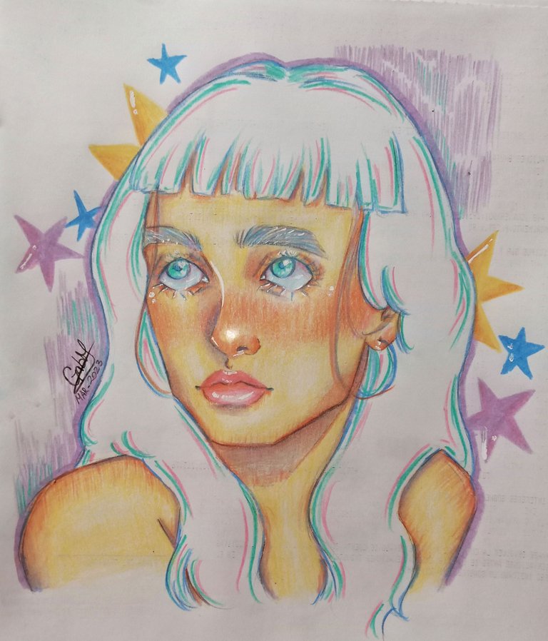
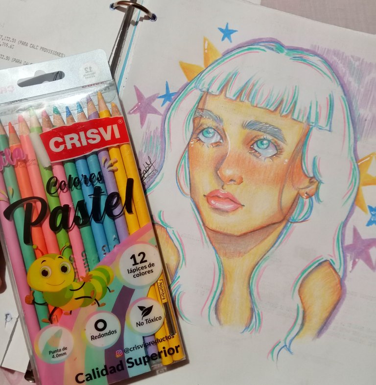
Este es el resultado del dibujo, concluí el dibujo usando el corrector líquido blanco para hacer los brillos en sus labios, nariz y ojos además de agregarle unos brillos a sus párpados y pestañas, ya para finalizar difumine los ojos con color blanco así como también la punta de su nariz y sus labios. Como pueden ver los colores se ven bastante vibrantes y muy suaves y así como se ven son bastante fáciles de usar y aunque tenía miedo de usarlos pues decidí romper la rutina y dibujar algo bastante colorido y llamativo, quise buscar un retrato expresivo y el que use tiene específicamente unos ojos muy llamativos que me convencieron de dibujarla. Que opinan? La verdad los recomiendo mucho y veo que la marca crisvi va a destacar por su gran calidad en cuanto a colores. 💗✨
This is the result of the drawing, I finished the drawing using the white liquid corrector to make the glitters on her lips, nose and eyes as well as adding some glitters to her eyelids and eyelashes, Finally, i blur the eyes with white as well as the tip of her nose and lips. As you can see the colors look quite vibrant and very soft and as you can see they are quite easy to use and although I was afraid to use them I decided to break the routine and draw something quite colorful and striking, I wanted to look for an expressive portrait and the one I used has specifically some very striking eyes that convinced me to draw her. What do you think? I really recommend them a lot and I see that the crisvi brand is going to stand out for its great quality in terms of colors. 💗✨
Espero que les haya gustado y gracias por apoyarme siempre! Nos vemos pronto y sigan creando.❤️/
I hope you liked it and thanks for always supporting me! See you soon and keep creating! ❤️
Realicé la traducción en
https://www.deepl.com/es/translator
Todas las imágenes son de mi autoría/ All the photos are my property
https://twitter.com/1364285906404970500/status/1640030741210775557
The rewards earned on this comment will go directly to the people( @gabsartbook ) sharing the post on Twitter as long as they are registered with @poshtoken. Sign up at https://hiveposh.com.
!discovery 30
This post was shared and voted inside the discord by the curators team of discovery-it
Join our Community and follow our Curation Trail
Discovery-it is also a Witness, vote for us here
Delegate to us for passive income. Check our 80% fee-back Program