UI/UX Designs: What I have been up to lately
It has been a while I updated my blog concerning the journey I have taken in becoming a UI/UX designer. This is, in part, due to the fact that I lost a bit of steam enthusiastically, and partly because I have been preoccupied with one of the assignments given to me, the success of which comes as a prerequisite to moving to the next stage of the internship program.
Concerning the assignment, I was to solve the problem associated with the donation of books in Africa, be it ebooks or hard copy books of different genres. Of course, I was to approach the subject as a UI/UX designer. First I needed to interview the target audience - those who are book buyers/readers and willing to donate their old books but have been having problems doing so. In other words, I had to conduct user research.
After conducting the research, I aggregated the response and came up with a user persona. From there, I came up with the user story and designed the user flow. Being my first time doing this, I felt totally overwhelmed and lost inspiration. In fact, I felt like giving up at some points. Anyway, the good news is that I did not give up.
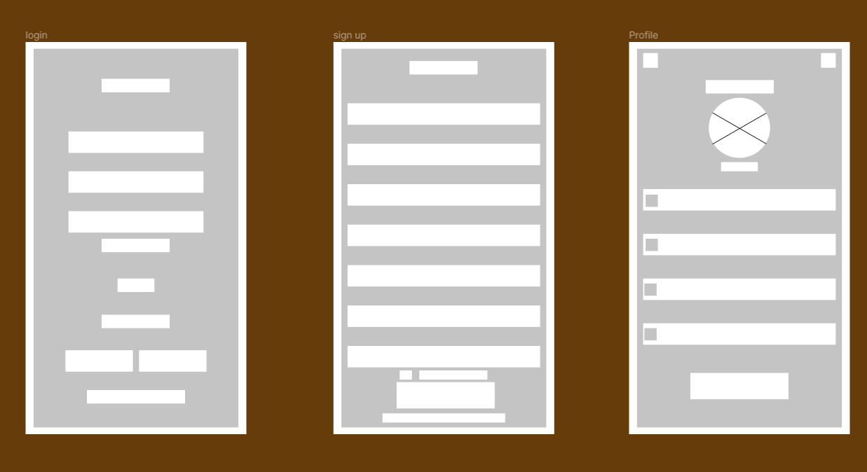
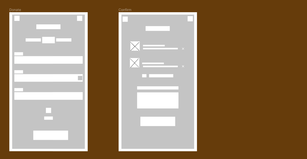
Next was for me to design the wireframes. The instruction was for me to design both low fidelity and high fidelity wireframes for the platform that will solve the problems of the user persona I have come up with. I spent hours and days chopping and changing a lot of things. I have never attempted designing a mobile app interface before - it has always been web platforms. Anyway, I thought the best solution to addressing the pain points of my user persona is to design a mobile app.
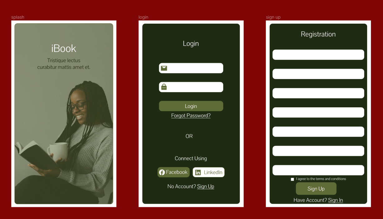
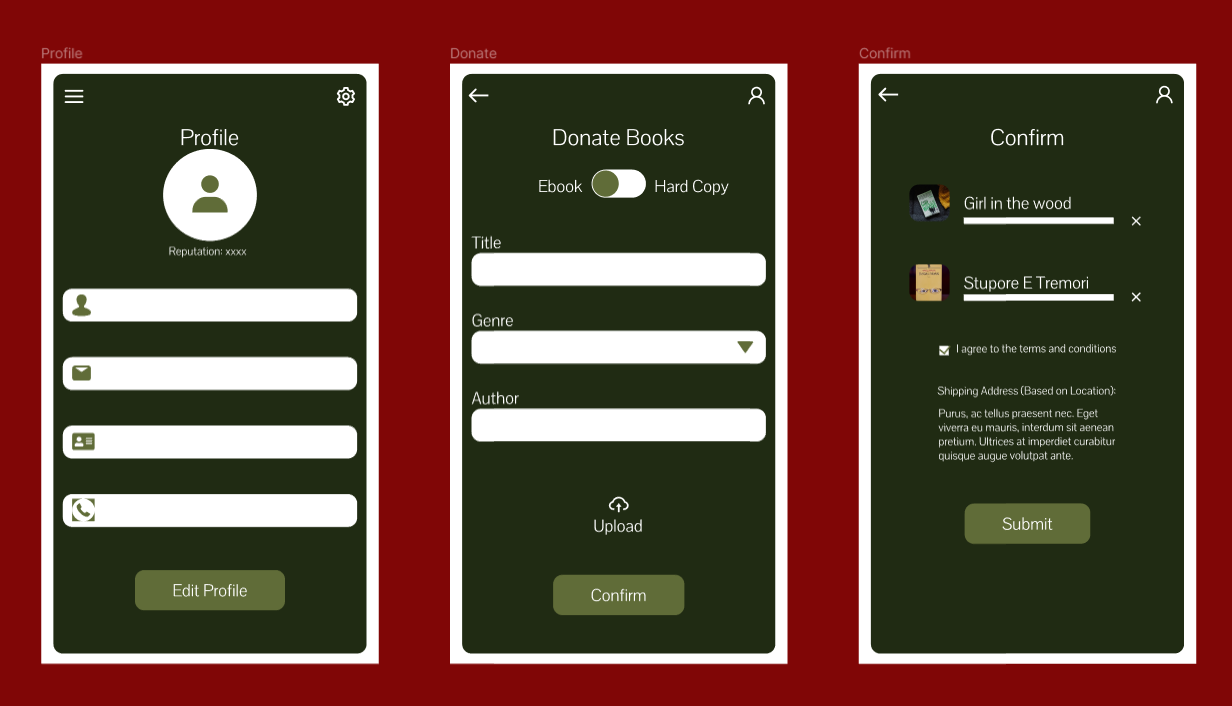
While doing all these, the time allotted for me to finish up has, far, been exceeded. Nevertheless, I did not entirely give up. My preliminary submission was rejected because I did not submit the low fi wireframe with it. Today, however, I successfully completed the low-fi and hi-fi wireframes. The screenshots of what I came up with are those I have shared in this post. I sincerely do not know how to grade myself or if my mentor will find it good enough. I am just hoping for the best and expecting the worst.
What do you guys think of these designs? Your honest assessments would be sincerely appreciated.
Congratulations @gentleshaid! You have completed the following achievement on the Hive blockchain and have been rewarded with new badge(s) :
Your next payout target is 14000 HP.
The unit is Hive Power equivalent because your rewards can be split into HP and HBD
You can view your badges on your board and compare yourself to others in the Ranking
If you no longer want to receive notifications, reply to this comment with the word
STOPTo support your work, I also upvoted your post!
https://twitter.com/gentleshaid/status/1447661576673169414
The rewards earned on this comment will go directly to the person sharing the post on Twitter as long as they are registered with @poshtoken. Sign up at https://hiveposh.com.
Thoughts about your design, I think they are beautiful and neat but you might need to attend a sprinkle of other colors, it would make it more eye-catching.
Found your post via @dreemport
Thank you. I know I need to improve in terms of color selection. Was just glad to get this over with.
Glad to hear you stuck with it. Just curious, why did you seem to lose motivation? Was it the assignment itself, the topic, etc.?
I think it's a combination of everything. It's just a phase of which I have been told it's a normal part of becoming a designer. Many give up at this stage. I'm just glad to have been able to pull through. The good news is that the assignment got accepted and I have been moved to the next stage earlier today.
Great! I am glad you made it through and all turned out okay. Just another learning experience for sure.
I can't wait to see what you work on next.
Though I am not a graphic design expert, I would argue that the design is too dark. So the contrast white areas create is excessive. The colors are fine on the first one. (the one with grey color)
Thanks for the sincere input. I will put this into consideration onward.
Great to hear that you managed to persevere and that you have been selected to move onto the next phase of the design journey. All the very best. From what I've seen and experienced of mobile interfaces, these look familiar in style and function. Perhaps a bit more colour would make them more appealing as already said by @khaleesii. All the very best with the next stage of the journey. I came to your post via @dreemport.
Thanks. I really appreciate this feedbacks. They will help me to improve on my future designs.
Hmm you've been up to so much from the look of things here and I must say it was productive and that is what matters.
The designs are nice according to someone who's not good at designing 🙈 but I bet it would look more lovely with brighter colors.
Well done on this one, I hope you get a good remark from you mentor.
Got here through @dreemport
Thanks for the input. Yes, many have complained about the colour. I will take that into consideration in my future designs.
That's great then, all the best with more of your findings and learning
Hello @gentleshaid. First I want to ask if this assignment in your current place of employment? If so, should you be placing work projects on the internet?
Read through @dreemport
Thanks for asking. No, it is not my place of employment. I would not have done that..lol
It is an assignment from an internship training and I did not sign any NDA with anyone. This is my intellectual property.