CSS UNITS APPLICATION GUIDE - vh, fr, rem, em, px, many more

Hello hive devs,
In this article I would like to discuss about CSS units, its applications and best for use in every case.
Every property in CSS is given a value, these values can be in from of text or numbers or units. Units are also like numbers but have extra characters behind them. Units are used to specify width, height, length, and font-size, or any other required measurement styling.
Absolute and Relative Units
Length Units are grouped into two categories: absolute and relative
- Absolute units are fixed and specific, any length or size specified with theses units will appear exactly that size. They are independent units.
- Relative units are dependent on another length property. mostly from the parent element.
| Absolute | Relative |
|---|---|
| cm | em |
| mm | % |
| in | ch |
| px | rem |
| pt | vh |
| pc | vw |
| ex |
Here are some common units in CSS
| Unit | Name | Function/Description |
|---|---|---|
| % | Percentage | height or width relative to parent size |
| ch | Character Unit | measurement for monospaced and fonts widths |
| cm | Centimeter | specifies absolute length or size |
| pt | Points | length( height and width )absolute |
| ex | x-height | used to increase over-short characters (x) |
| Fr | Fractional Unit | calculates gaps and division in grid |
| in | Inches | specifies absolute height or width |
| mm | Millimeters | specifies absolute length or size |
| pc | Picas | can be used in lieu of pt and px performs same function |
| em | em typography | mostly used for font size |
| rem | Root em | sets length or size relative to root document |
| px | Pixels | widely used for screens and resolutions |
| vh | Viewport Height | specifies height based on viewport |
| vw | Viewport Width | specifies width based on viewport |
% Percentage
Percentage specified is relative to the parent size of the subsequent element.
For example
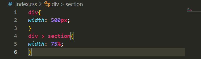
since the parent div width is 500px, the inner div section will be 375px (500 * 0.75)
ch
The ch unit works as an exact measurement for mono-spaced / fixed width fonts like Courier.
The CSS ch unit is defined as the width of the character "0" (zero, or U+0030) of the font.
It can be unpredictable with some other fonts like Arial for instance.
It varies according to font family
pt
1pt is about 1.3333 pixels, or 1/72th of an inch.
so if I set my value to 12pt it is same as 16px and vice versa
ex
In CSS, 1ex is the x-height of the font, or half of 1em, Since the size of X varies with font family, it is rarely used
ex gets its name from the x- character or the letter x in font
fr
Fr is a fractional unit.
When gaps in the grid are taken into account, the Fr unit is an input that automatically calculates layout divisions.
1fr is 25% of available space.
in
1in = 96px = 2.54cm
Centimeters (cm)
1 cm is about 37.8 pixels, or about 25.2/64 of an inch.
mm
1mm is about 3.78 pixels, or 1/10th of a centimeter
In conversion to centimeter, millimeter is 10X lesser than centimeter ( 1 centimeter = 10 millimeter) 3.78*10 (mm) will give us 37.8cm
pc
1pc is about 16px, or 1/6 of an inch, or 1pc = 12 pt
This is a better option instead of inputting higher values in other units, you can use this unit.
32px = 2pc,
24pt = 2pc,
pt is 12times lesser than px in number
em
em as a Relative unit is relative to the font-size of the element it is contained (parent element) (2em means 2 times the size of the current font).
For example
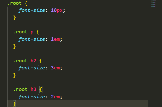
font-size of p is 10px (10 * 1) while that of h2 is 30px(10 * 3) and h3 is 20px (2 * 10)
rem
Root em as a relative unit is not affected by the size or setting of a parent element that is the container it dwells , instead it is based on the root(html) of the document, for websites.
Default font size is 16
HTML font-size is 16px.
For example
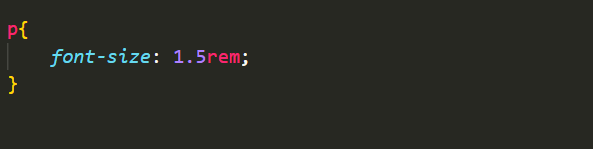
The font-size p will be = 24px (1.5 * 16)
This is default in most browsers, if it is changed by user, p will also follow according
px
Pixels, or px, is one of the most common length/size units in CSS, it is widely used and acceptable
it is one of the of the oldest screen and media unit.
1 pixel = 1/96 of an inch.
All other absolute units are based on the definition and value of pixel
1px means something in other units, pc = 0.0625, pt = 1.333
vh
View height: 1vh is 1% of the height of the viewport.
A full web page height is 100vh by default
It works like the percentage unit as well. Specifying 10vh is equivalent to occupying 10% of entire visible screen height.
For example
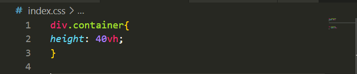
The container div will fill 40% of the viewport's height. So if the browser window is 1000 pixels high, the height of the div will be 400 pixels.
vw
1vw is = 1% of the viewport's width
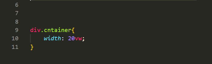
The container div will fill 20% of the viewport's width. So if the browser window is 1000 pixels wide, the width of the div will be 200 pixels.

- In the making of this article I made references to
- freecodecamp: https://www.freecodecamp.org/news/css-unit-guide/
- w3schools: https://www.w3schools.com/cssref/css_units.asp
- Lead Photo was made with Adobe illustrator
- All images are gotten by me except stated otherwise
👉 Hope this article was helpful, kindly leave a comment, reblog and upvote
Until next time,
stay woke✌️.
I am used to using rm compared to using px. I feel it would make the view more like the way I want it when there is a change in the screen size.
For instance, smart watches. They would obviously have a smaller font size than 16px. Not to make everything look too big, a relative unit is best.
When I am ready to build up my Frontend skills. I would run to you brother.
I agree with you on this, relative units are best, although I've been using absolute units but after my research for this post, I have to start using relative units more.
Glad to have you boss, I believe we will learn together
Very nice article bro. Most of the time I use only rem and em, you will hardly find absolute units like px in my projects. I usually set the font-size of the html to 62.5% (that means 10px). That makes it easier to use rem units, I know that 2rem will be 20px. For margins, paddings and media queries, I use em (never use rem for media queries).
Hmmmm
Thanks @kushyzee for this great reply
I have learnt something from you😊, not to use rem for media queries
Also I would like to ask when is best to apply absolute units,
Absolute units especially px can be used when you don't want a user to change the size of a particular element, maybe small things like shadows or borders but it's best not to use too much of absolute units, they are best used in prints.
Check out this video
We are the same. For my projects, you would not find any absolute units. Mostly em and rem...
They are basically all we need, absolute units aren't really needed that much
Dear @joebolite97,
May I ask you to review and support the Dev Marketing Proposal (https://peakd.com/me/proposals/232) we presented on Conference Day 1 at HiveFest?
The campaign aims to onboard new application developers to grow our ecosystem. If you missed the presentation, you can watch it on YouTube.
You cast your vote for the proposal on Peakd, Ecency, Hive.blog or using HiveSigner.
Thank you!