Intro to responsive web designs with CSS media queries

Everyone in the frontend web development field is familiar with the term "responsive web design" and it's simply a way of developing websites in a way that will be responsive depending on the device it is being accessed from.
This means that the website is built to adapt to the screen sizes of users and provide an optimal viewing experience. This is where media query is very powerful, as it enables developers to tailor styles based on the features of the user's device. However using media queries can be intimidating at first, so I will be giving a practical introduction in this article.
Getting started
The first thing to do before writing responsive design codes in your CSS is to include the appropriate meta tag in your html file and I'm talking about this code; <meta name="viewport" content="width=device-width, initial-scale=1.0"> because without it, your responsive design isn't going to work at all.
As I said earlier, this is going to be a practical guide, so let's start with some html
<body>
<main>
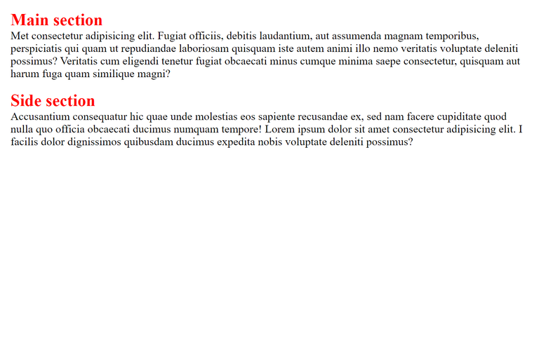
<h2>Main section</h2>
<p>Met consectetur adipisicing elit. Fugiat officiis, debitis laudantium, aut assumenda magnam temporibus, perspiciatis qui quam ut repudiandae laboriosam quisquam iste autem animi illo nemo veritatis voluptate deleniti possimus? Veritatis cum eligendi tenetur fugiat obcaecati minus cumque minima saepe consectetur, quisquam aut harum fuga quam similique magni?</p>
</main>
<aside>
<h2>Side section</h2>
<p>Accusantium consequatur hic quae unde molestias eos sapiente recusandae ex, sed nam facere cupiditate quod nulla quo officia obcaecati ducimus numquam tempore! Lorem ipsum dolor sit amet consectetur adipisicing elit. I facilis dolor dignissimos quibusdam ducimus expedita nobis voluptate deleniti possimus?</p>
</aside>
</body>
The body tag contains two elements: main and aside. Within main, we have a h2 and paragraph elements, the same can be seen in aside. This sort of arrangement is mostly seen in blogs where the main section is on one side while the aside which typically contains ads is next to it. But before we implement that, let's take a look at the CSS:
body {
    padding: 1.5rem;
}
h2 {
    color: red;
}

Just very simple styles, nothing complicated. The webpage will look the same on all devices despite their size. It looks okay on mobile devices but on larger displays like a laptop, it doesn't look so good. So, it's better to move the side section to the side of the main section and there are a couple of ways to do this but the easier and better way is to use media queries. The simple syntax for media query is this:
@media only screen and (min-width: 768px) {
    body {
        color: blue;
    }
}
@media only screen simply means we are targetting only screens and as you have guessed, we have other @media types such as print, speech, etc. After that, we specify the condition within parentheses and for the above code, we are targeting screen sizes with a minimum size of 768px which is the typical screen size of tablet devices.
Then within the curly brackets, we start writing styles for the screen sizes that meet that condition (at least 768px). So, to sum it up, we are targeting screen sizes with a minimum size of 768px and changing the body color to blue. Screen sizes below 768px will retain the default color which is black but once the screen size gets to 768px and above, the color changes to blue.
Let's do something similar for our webpage and for this, we will be shifting the side section to the right side of the main section, changing the color of the h2 elements from red to blue, and also changing the color of the paragraph texts from black to grey
@media only screen and (min-width: 768px) {
    body {
        display: grid;
        grid-template-columns: 1fr 1fr;
        gap: 2rem;
    }

    h2 {
        color: blue;
    }

    p {
        color: #3f3f3f;
    }
}

I simply changed the display of the body element to grid and if you can recall, the body element has two child elements: the main and aside elements. So, by using grid-template-columns, I created a 2-column grid layout with the side section now going to the side of the main section.
Also, you can see that the color of the h2 element has changed to blue and that of the paragraph texts are now grey. These styles only apply to screen sizes that are at least 768px, once I go below that (767px and below), the style will change to the previous one.
min-width might be confusing at first especially when you realize that there is also the max-width property, so there is another way for you to specify the screen sizes that a set of rules should apply to. I actually prefer this method and I'm guessing that people who are familiar with any programming language might prefer it as well:
@media only screen and (width > 767px) {
    body {
        color: blue;
    }
}
This simply means that the styles will apply to screen sizes that are greater than 767px, which means from 768px and above will have a body color of blue. You can also do it as width >= 768px which means that the style will apply to screen sizes that are 768px and above (greater than or equal to 768px).
Now, let's take things up a notch and introduce a new element to our side section which is going to be an image.
<aside>
        <article>
            <h2>Side section</h2>
            <p>Accusantium consequatur hic quae unde molestias eos sapiente recusandae ex, sed nam facere cupiditate quod nulla quo officia obcaecati ducimus numquam tempore! Lorem ipsum dolor sit amet consectetur adipisicing elit. I facilis dolor dignissimos quibusdam ducimus expedita nobis voluptate deleniti possimus?</p>
        </article>
        <img src="./image.jpg" alt="advertisement">
    </aside>
Now, we have 2 elements within the aside tag which are article and image elements. And as usual, we have our h2 and paragraph elements with the article. And now, for the styles applied to the image;
img {
    width: 100%;
    margin: 1rem auto;
}
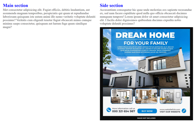
For screen sizes from 768px and above, we will have the above layout but I want the image to be on the right-hand side from screen sizes of 1024px and above which is typically for large devices
@media only screen and (width >= 1024px) {
    aside {
        display: grid;
        grid-template-columns: 1fr 1fr;
        gap: 2rem;
    }
    h2 {
        color: green;
        font-size: 4.2rem;
    }
    p {
        font-size: 1.8rem;
    }

}
It is simply a matter of creating another @media rule and this time, we will target screen sizes that are equal to or greater than 1024px (from 1024px and above). First, we will change the display of the aside element to grid, and then give its 2 child elements a fraction of the available space. This will push the image to the right of the side section.
And now, for screen sizes of 768px to 1023px, we are going to have the above layout, while from 1024px and above screen size, the layout will switch to the below picture with a bigger font size and green color for the h2 elements, that is the power of media queries.

This method of writing media queries is for people who prefer a mobile-first approach when it comes to building a website. For people who love to build the desktop version first before moving to the mobile version, then the max-width property is for you. That is:
@media only screen and (max-width: 768px) {
    /* Write your styles here */
}
OR
@media only screen and (width <= 768px) {
    /* Write your styles here */
}
This will simply target devices that are 768px and below and apply the styles you specified to them, that's assuming you already created styles to target devices with screen sizes above 768px. As for me, I prefer the mobile-first approach.
Thanks for reading

Connect with me on:
Twitter: @kushyzeena
Readcash: @kushyzee
Edited with Canva
Hmm...Nice post on the impotence of media queries one question though...I normally use;
Is this a good practice? Perhaps just another way, or does it mean I'm not specific that the code should only target screens and nothing more?
I actually use this most of the time because I'm too lazy to write the one that targets only screen (the syntax is longer). I guess using
@media only screendepends on if you want to write media queries targeting other types (like print) or you specifically want to target screens but for general purposes, you can just use only@mediaOhh alright...Thanks!!
Thanks for your contribution to the STEMsocial community. Feel free to join us on discord to get to know the rest of us!
Please consider delegating to the @stemsocial account (85% of the curation rewards are returned).
You may also include @stemsocial as a beneficiary of the rewards of this post to get a stronger support.