What is Typography Selection?
Selecting typography for a brand is so much more than just choosing a couple of fonts that look nice together. It’s about prescribing select fonts for select areas of your brand that will help your brand to be distinct, cohesive and legible. It also takes all of the guessing and confusion out of preparing designs for your brand.
Firstly, I start my search for the brand’s “hero” typeface. As other designers will attest, we can easily spend hours trawling through typography websites, searching for “the one” that successfully captures the personality of the brand and communicates the key feelings we want to portray.
Once I’ve settled on the “hero” typeface for the brand, I select complementary typefaces to support it — and most importantly, not compete with it.
Less is more
Generally speaking, the less variety you have with fonts in your design, the more clean, cohesive and professional it will look. Type can be fun to play with, but it’s best to leave the more decorative fonts to typographic posters or artwork.
The golden rule: type should always be legible, first and foremost. What is the point of a beautiful typeface is your message is lost? Don’t use display fonts as body copy (please)!
When you’ve spent years looking at type like I have, you’ll begin to identify all the subtle variations that give type their distinct personalities.
A tip: When in doubt, return to the classics. There are typefaces that have humbly remained popular for decades, and for good reason: they’re timeless. Trendy fonts .. again, are fun to play with, and are perfect for some designs, but I’m wary when it comes to using them for branding. This is because they will date if they’re based on a current trend. A good example of this right now is probably all that wavy, psychedelic type that’s going around. In a year or two, logos designed with these fonts will look outdated.
What is the difference between “typography” and “font”?
Let me digress for a moment to explain the difference between “typography” and “font”. While even I use the two terms interchangeably, the correct explanation is this: Typography refers to a complete family of individual fonts. So, the latter belongs to the former. For example, Helvetica is a well-known typeface, but it is made up of several fonts: in different weights (thin, light, medium, bold, etc), as well as widths (condensed, extended, etc).
So, Helvetica is a typeface, but Helvetica Light Oblique is a font.
The typography selection process
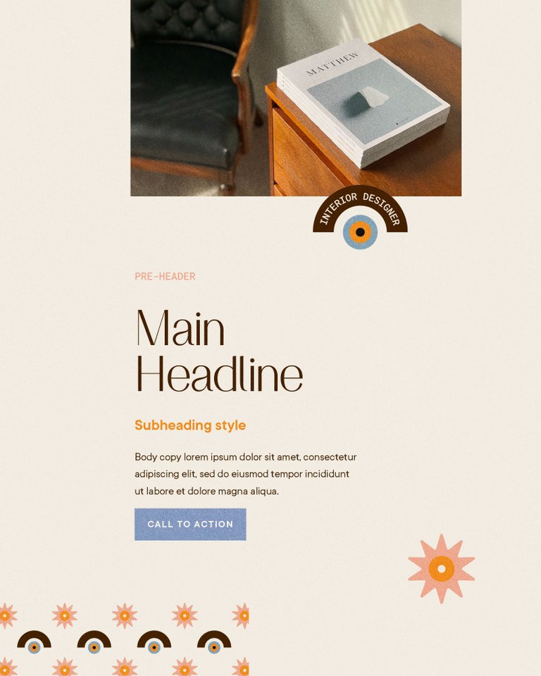
Once I’ve selected the hero typeface for a brand, I’ll begin building out the typographic hierarchy. This means identifying fonts that will work best for different areas, including the pre-header area (think tags, categories, minor details such as the date), the main headline (hero typeface), sub-heading, body copy and call to action areas such as links and buttons.
It’s important to stick to your ‘prescription’ of fonts that have been selected for these areas. For example, the hero typeface is usually a display font, meaning that it is specifically designed for larger headline areas and not extended passages of body text. Usually, display fonts have more eccentric and variable design features that just make it hard to read if used as a body font. And remember the golden rule? Legibility. Don’t use display fonts as body copy. Ever.
And similarly, don’t use your body copy font as a headline. Fonts that I choose for body copy are always clean and simple, and are designed for readability, not personality. Having said that, there are thousands of variations of styles of fonts suitable for body copy, and personality does play a factor. It’s just less of a consideration than with the hero typeface.
Finally, your brand colours are incorporated into the selection. A darker colour in your palette is used for the body copy, mid-shades for the heading and sub-heading, lighter or brighter colours for the pre-header area and hyperlinks, and the boldest, brightest pop of colour (sometimes called the accent colour) for any call-to-action areas, such as web buttons. This is generally the approach I follow for a unique typography combination that is distinctive and works well together.
Putting it all together
Once you have your typography selection and typographic hierarchy, you’ll never have to guess how and where to use what font, ever. You’ll be able to pull together blog posts, website pages, newsletters, social media stories and printed collateral with ease.
I always outline the exact fonts, weight, size and any other features I’ve recommended (such as tracking), in your brand guidelines document, so you can quickly refer to it. And if you need Canva templates prepared for you to grab and go, I can do that, too.
Need help selecting typography for your brand? It’s included in all of my branding services.
The featured image for this post shows typography selection for Diana Parker, one of my semi-custom brand kits available for purchase. Upon purchase, I provide the full breakdown of fonts to guide you how to use your new brand.
branding services
#typography #brandidentity #branddesigner #fonts #typographyselection #branding