[ENG/ESP] Splinterlands Art Contest Week 233- My version of FROST LION!
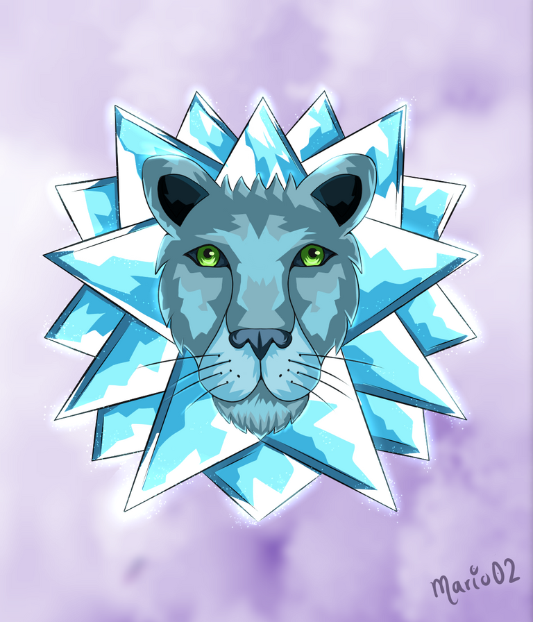

Greetings users of the #Blockchain community of @splinterlands, I hope you are all feeling well today. This time I want to share with you my participation to the art contest #233 corresponding to this week in which I decided to make my own version of the character "Frost Lion", this is of the Water element and it is quite peculiar as it belongs to a very cold and brutal world in which only creatures with frost and ice in their blood can live and these Ice Lions are the kings of the place. This description caught my attention so without further ado I show you my creative process to make this character.
Saludos usuarios de la comunidad #Blockchain de @splinterlands, espero que todos se encuentren muy bien el día de hoy. En esta ocasión quiero compartir con ustedes mi participación al concurso de arte #233 correspondiente a esta semana en el que decidí realizar mi propia versión del personaje "Frost Lion", este es del elemento Agua y el mismo es bastante peculiar ya que pertenece a un mundo bastante frió y brutal en el que solo pueden vivir criaturas con escarcha y hielo en la sangre y estos Leones de hielo son los reyes del lugar. Dicha descripcion me llamo mucho la atención por lo que sin mas que decir les muestro mi proceso creativo para llevar a cabo este personaje.
Creative Process | Proceso Creativo
To create this illustration I decided to return a little to the style that I had some time ago, I describe this style as a kind of vector art in which flat colours predominate without blurring between them, besides having a well defined lineart and without so many details.
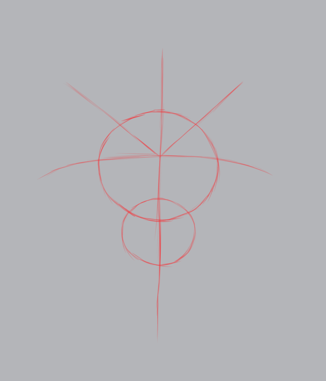
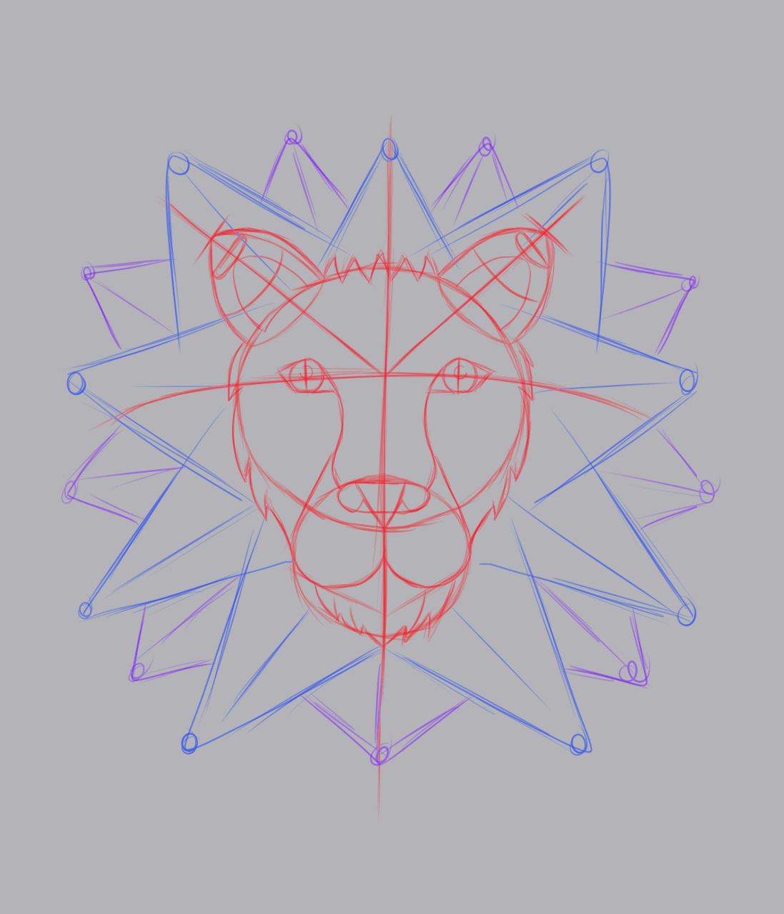
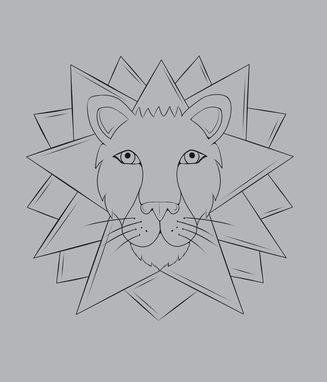
In this case and as in any illustration I started creating a sketch from two circles which serve to delimit the size of the head and muzzle of the character. Then I decided to divide in half these shapes with a kind of cross which would serve me to place the eyes and ears of the lion. For the latter I created two cylinders with a triangle point to create the two ears as well as using basic shapes to create the nose and the last details of the sketch. Finally I chose to create a kind of star around the character to simulate his mane, which in this case is formed by ice points.
Para crear esta ilustración decidí volver un poco al estilo que tenia tiempo atrás, dicho estilo lo describo como una especie de arte vectorial en el que predominan los colores planos sin difuminarlos entre si, ademas de tener un lineart bastante definido y sin tantos detalles.
En este caso y como en toda ilustración empece creando un boceto a partir de dos círculos los cuales me sirven para delimitar el tamaño de la cabeza y hocico del personaje. Luego decidí dividir a la mitad estas formas con una especie de cruz la cual me serviría para ubicar los ojos y las orejas del león. Para este ultimo cree dos cilindros con punta de triangulo para crear las dos orejas así como también utilice figuras básicas para crear la nariz y los últimos detalles del boceto. Finalmente opte por crear una especie de estrella alrededor del personaje para simular su melena, que en este caso esta formada por puntas de hielo.
Finished the sketch I proceeded to make the lineart of the character, for it I chose to use a type of line not very thick since I didn't want to give a so exaggerated aspect to the character. First I began by the character in which I only remarked with something but of thickness the lines of his eyes, the rest of the character I wanted to leave it with the same linear value, unlike his mane in which I raised a little the thickness to separate it a little of the character as well as I also added some lines of detail to the same one.
Terminado el boceto procedí a realizar el lineart del personaje, para ello opte por utilizar un tipo de linea no muy gruesa ya que no quería dar un aspecto tan exagerado al personaje. Primero comencé por el personaje en el que solo remarque con algo mas de grosor las lineas de sus ojos, el resto del personaje quise dejarlo con el mismo valor lineal, a diferencia de su melena en la cual subí un poco el grosor para separarla un poco del personaje así como también agregue algunas lineas de detalle a la misma.
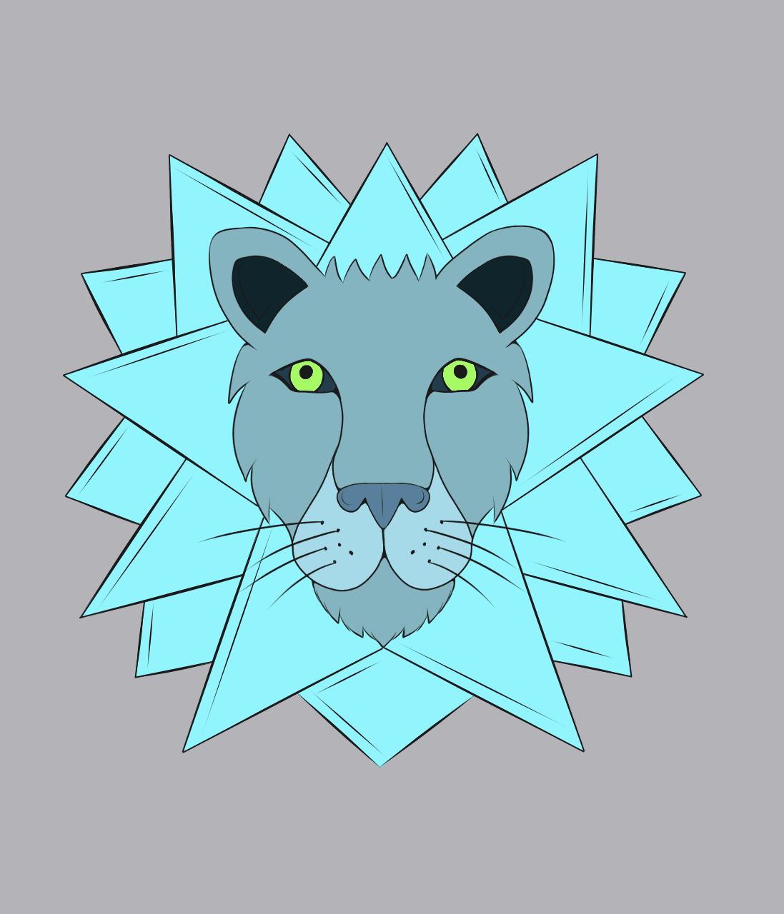
Once the inking was finished I started to colour the character. For this I used practically the same palette of colours of the reference, these are mainly cold tones in which I also play with grey tones which are perfect for the concept that the character has. In this case I was placing the base colours to each of the elements that this lion has.
Una vez terminado el entintado empece a dar color al personaje. Para ello utilice prácticamente la misma paleta de colores de la referencia, estos son principalmente tonos fríos en el que se juega también con tonos grises los cuales son perfectos para el concepto que tiene el personaje. En este caso fui colocando los colores bases a cada uno de los elementos que posee este león.
After placing the base colours it was time to apply some shadows to the character, as the style I'm working with is flat, I placed some lines or patches to simulate some shadow, for this it was useful to play with the layer blending modes to assign the shadow colours to this character. In the ice area I created some shadows with two shades of blue to make them stand out a bit more and also to give the ice aspect.
Después de colocar los colores base tocaba el turno de aplicar algunas sombras al personaje, como el estilo que estoy trabajando es del tipo plano fui colocando algunas lineas o parches para simular algo de sombra, para ello me fue de utilidad jugar con los modos de fusión de capas para asignar los colores sombra a este personaje. En la zona de hielo fui creando algunas sombras con dos tonos de color azul para que resaltaran un poco mas y también para dar el aspecto de hielo.
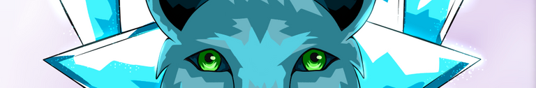
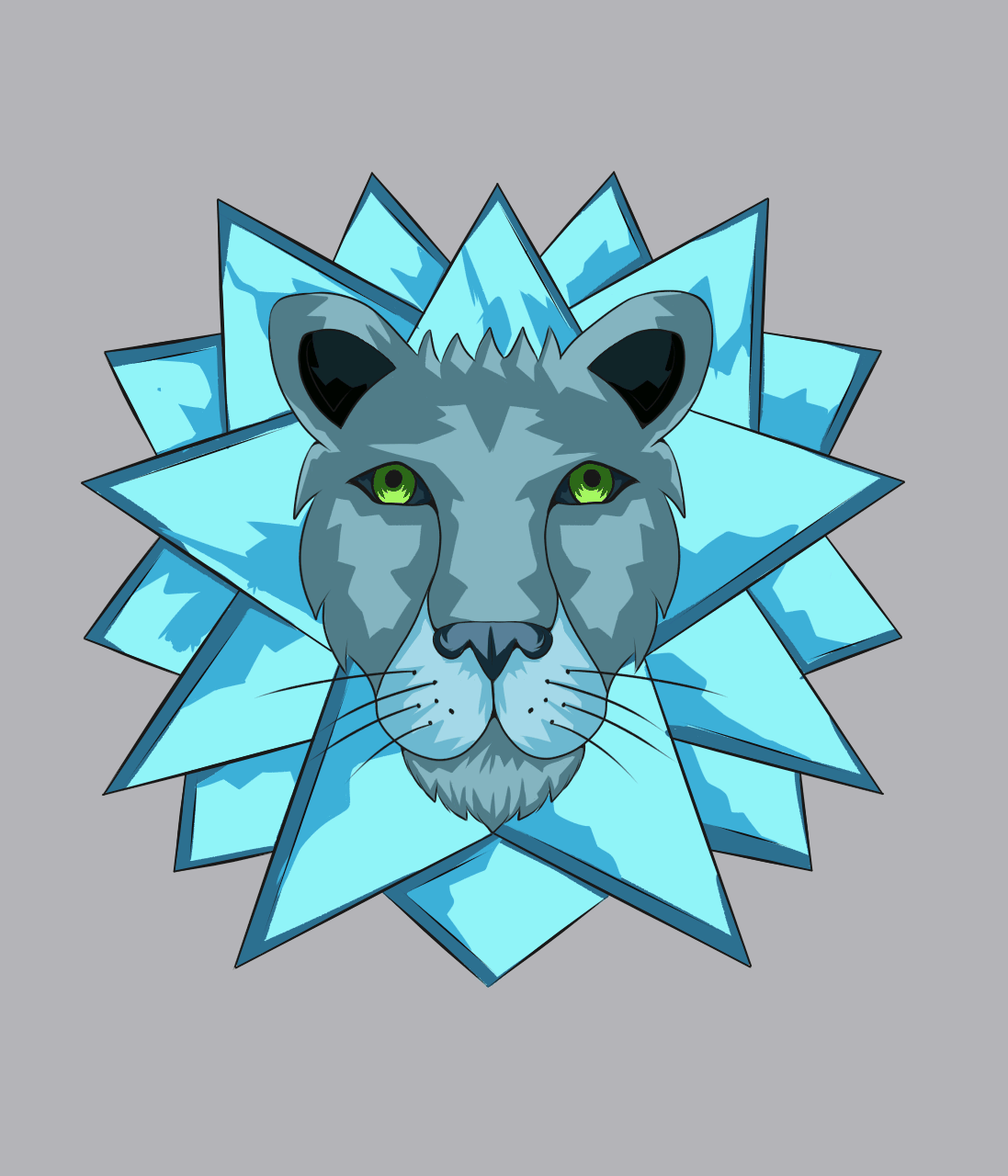
Finally the aspect that I considered most important in this illustration: The light, from the beginning I had in mind that the lights would be key to give the effect that I wanted to give to the character, for it I made some patches with lines of white colour in all the zones of ice and also I applied others but of a bluish grey colour in all the fur of the character, although I considered that the result looked good I still felt that something was missing for what with the airbrush I added something more of light in form of glow for the tips of the mane of ice as well as in the contour of the face and the eyes.
Finalmente el aspecto que consideraba mas importante en esta ilustración: La luz, desde el inicio tuve en mente que las luces serian clave para dar el efecto que buscaba dar al personaje, para ello realice algunos parches con lineas de color blanco en todas las zonas de hielo y también aplique otros mas pero de un color gris azulado en todo el pelaje del personaje, aunque consideraba que se veía bien el resultado aun sentía que faltaba algo por lo que con el pincel aerográfo agregue algo mas de luz en forma de resplandor por las puntas de la melena de hielo así como en el contorno de la cara y los ojos.
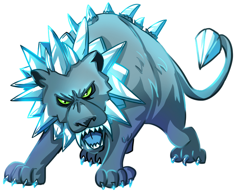
Finished the character I wanted to place it in a simple background, I made a kind of clouds so to speak with the difference that these are in a purple tone to give a different touch to the illustration.
Terminado el personaje quise colocarlo en un fondo simple, realice una especie de nubes por así decirlo con la diferencia de que estas son en un tono morado para darle un toque diferente a la ilustración.
And that's the end of this illustration, I really enjoyed the creative process used in this image because I like this kind of art style "vectorial" so to speak, although it is not. I'm very happy with the final result and I hope you all liked it, if you want you can support me and/or leave me a comment with any advice or opinion and I'll be glad to thank you, thank you very much for watching until the end and see you next time!
Y así doy por culminada está ilustración, disfrute mucho el proceso creativo empleado en esta imagen ya que me gusta mucho este estilo de arte tipo "vectorial" por así decirlo aunque no lo sea. Estoy muy contento con el resultado final y espero que haya sido del agrado de todos ustedes, si deseas puedes apoyarme y/o dejarme un comentario con algún consejo u opinión y con gusto te lo agradeceré. ¡Muchas gracias por ver hasta el final y hasta la próxima!
Tools Used | Herramientas Utilizadas:
- Medibang Paint Pro PC version 64 bits
- Tablet Huion H610 PRO V2
REFERENCE
Translated with DeepL (free version)
All images are my property, including the separators used in the post!
Thanks!
Do you know you can win a Chaos Legion pack and many other things just by following some simple steps ?? Check out our Latest Daily Showcase and Participate our latest Giveaway. Thanks
Thank you very much for your support! 🙏
Thanks for sharing! - castleberry#6859

Thanks for your support!
it looks so dope tbh not like realistic but like as a logo design this is so impactful loved it😍
whats your instagram?