My proposal for the HBC design contest
Hello beautiful people of the internet, I hope you are doing great. Today I will be submitting my entry to the Hive Book Club Graphic Design Contest. I've been several days working on this project and I'm happy to be able to submit days ahead of the closing date, haha.
I've been studying and practicing design for about 2 or 3 years now, however, I hadn't had the chance to show you here some of what I know how to do. I hope you enjoy the process and also like the proposal as much as I do.
Concept
My creative process starts by looking for references on the theme, I research background, projects similar to the theme, I see lots of images that can inspire me to develop my own proposal in a creative way but also following the contest rules.
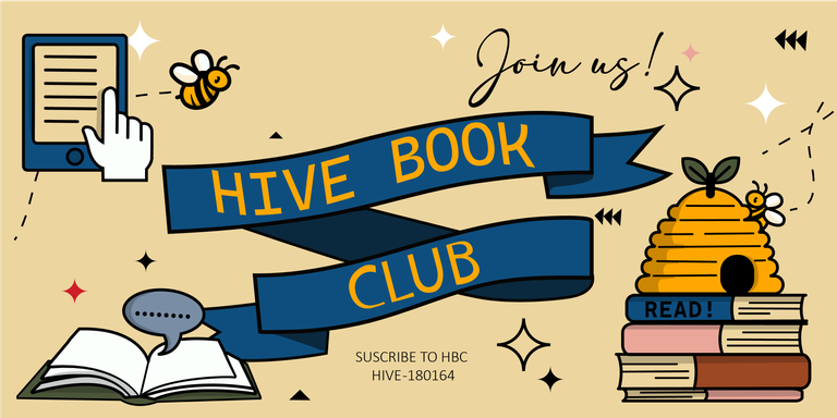
And that's how I developed some ideas that I started on paper and later transferred to the computer. The elements that I definitely wanted to be present are: the books and the bees, naturally the bees refer to the beehive, and to each person that represents this community.
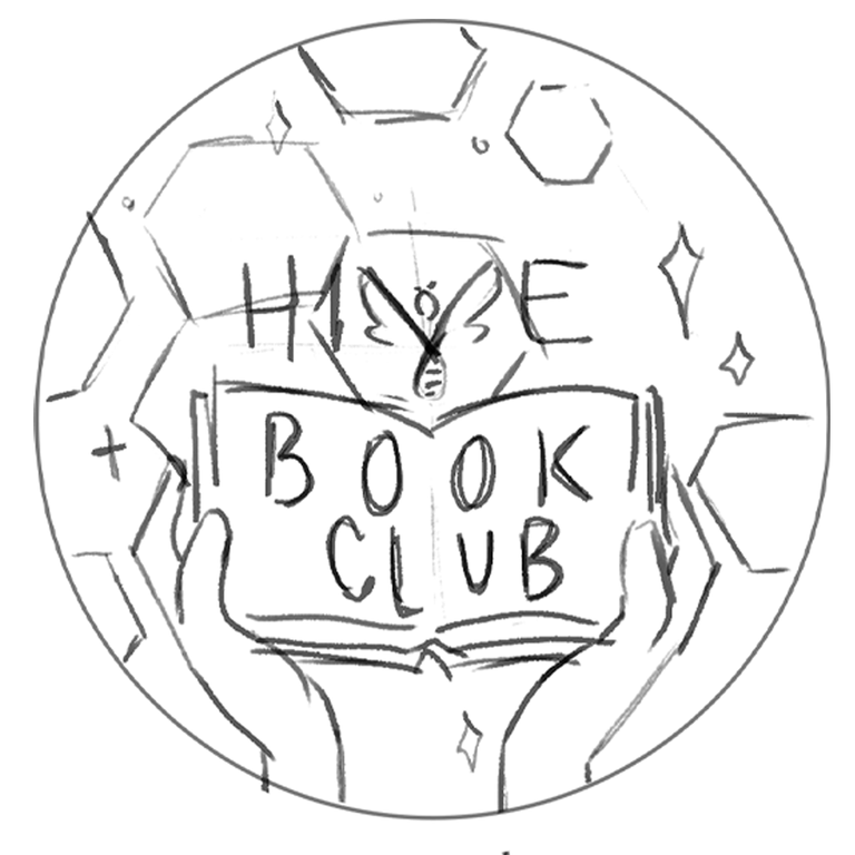
I made many sketches but this was the one I used as the basis for my proposal.
Logo proposals
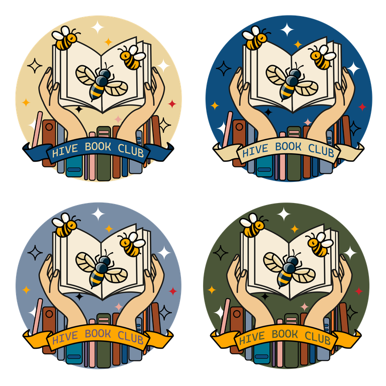
Adobe Illustrator was my program of choice for this design. I feel much more comfortable drawing each element on my own since I can manage the same style.
After a few adjustments and incorporating some extra elements, this was the result of the composition. I played with the color palette for the background and the name banner to have a wider and more varied proposal for the logo. I used a typeface called "Cascadia Mono", it's simple and legible, I decided to make this a rather illustrative emblem, with an animated but simple style.
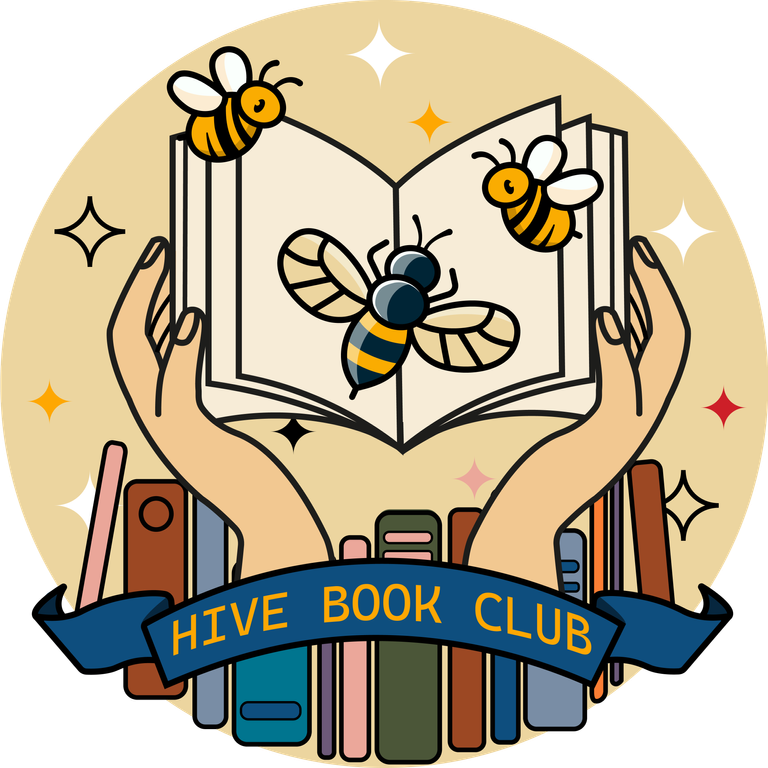
My favorite proposal is this one, I personally feel that the colors harmonize much better and it is more readable in different formats. As you can see, I used almost all the colors within the color palette that the HBC team provided us with, but I tried to use only a couple or three that were the ones that covered the most of the design.
Banners
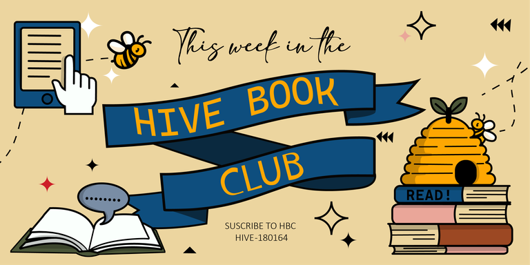
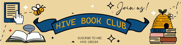
➡Banner of highlights
➡Invitation banner
➡Header for profile
Likewise, I continued with the banner, using the same color palette in its elements. I didn't want to overload the banner by adding too many things, I just incorporated a few new elements allusive to the community.
Divisor


For the divider I have these two proposals, one is more in line with the style I was already presenting in the logo and the banner, the other is a little simpler but I think it also goes with the theme. You are free to choose them or use them as you like.
Finally, these were my proposals. I love this community so I made this design with a lot of love, I hope you enjoyed this post.
I must also say that I feel admiration for the works of the other participants, there are very good entries!
See you soon!
Congratulations @nicxi! Your post has been a top performer on the Hive blockchain and you have been rewarded with this rare badge
You can view your badges on your board and compare yourself to others in the Ranking
If you no longer want to receive notifications, reply to this comment with the word
STOPCheck out our last posts:
Que bonito te quedó! Me gustó mucho la idea que escogiste para el diseño💜
¡Muchas gracias!❤️