My review on the New User Interface for Golem Overlord
It's been few days since we saw the change in UI for one of the best games on hive blockchain, Golem Overlord. I think I have used it for a good number of days and I can finally share a review in the form of my opinion. So stay with me throughout this blog to know what I think about the new user interface and then you can also share your opinion in the comments so that I can know your view on the same.
I will start with positive things in the new user interface. The new UI looks cool and beautiful and their is no doubt in that, it reflects a more modern UI which is definitely an upgrade we should applaud to. Let's have a complete look at the new UI in the screenshot below.

I like how the prestige levels are now given a flag, we are also not having the list of our stats on the left side which earlier use to take a lot of space that use to look a little bad specially for those who bought expensive NFT's from the market directly. We now have icons at the top left corner for each stats and that takes quite less space and to be honest looks good as well. At the right side you see your in game currency details on the top and other data on the bottom right.
Again, I like those icons there on the right side on bottom but let me share few things that I miss from the last UI for this game. They might be still there and it can be that I am just not able to figure out how to see them but I will mention them as I could not find anything relatable to them in last few days.
I miss the last 24 hours shards and parts burning and earning data. I miss that feature as I use to look at it and even write blogs when I use to burn a huge amount in the game. For shards you can see in the quest section and learn about how much you burnt but for parts I couldn't find any options.
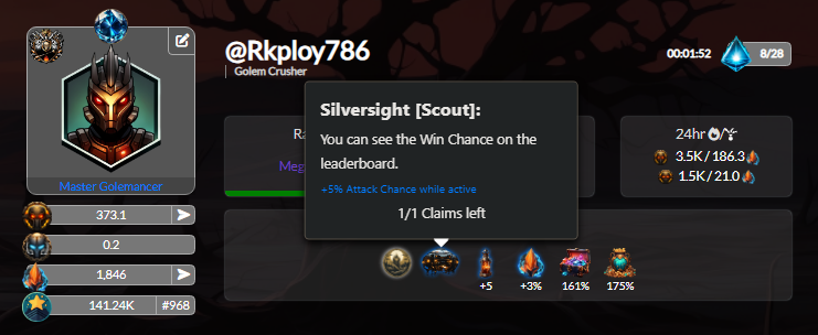
The screenshot above shows how it use to look like before. The next thing is reputation data, earlier it use to tell us how much XP is going to be generated every hour but now it does not, yes if you are someone who will search there then you will at least find how much parts you should burn for the max XP gains but you will still not know the numbers per hour.
Even the mining rate for parts is not visible now and to be honest that is also what I miss, though you can multiply number of golems with 0.12 to get the per hour parts production rate but it would have been good if we can see the production rate just by hovering over to the scavenger golem icon on the top left.
I have nothing against the new UI but it will take time to settle inside our heart as we were seeing the old UI for quite a long time. I am happy that team Golem is still working constantly on the game, that's all for now and before I leave here is a quest rewards that I won while writing this blog.
Thank You
This post has been manually curated by @bhattg from Indiaunited community. Join us on our Discord Server.
Do you know that you can earn a passive income by delegating to @indiaunited. We share more than 100 % of the curation rewards with the delegators in the form of IUC tokens. HP delegators and IUC token holders also get upto 20% additional vote weight.
Here are some handy links for delegations: 100HP, 250HP, 500HP, 1000HP.
100% of the rewards from this comment goes to the curator for their manual curation efforts. Please encourage the curator @bhattg by upvoting this comment and support the community by voting the posts made by @indiaunited.