My quick Hive Engine redesign
I couldn't think about what exactly I wanted to post today so I decided to edit a recent project I just submitted and make it a little more suitable as a Hive Engine redesign.
I think the current design is great, but you know, I had to play around with some minor things that I assume might be problems and place some other things in different places and voila!
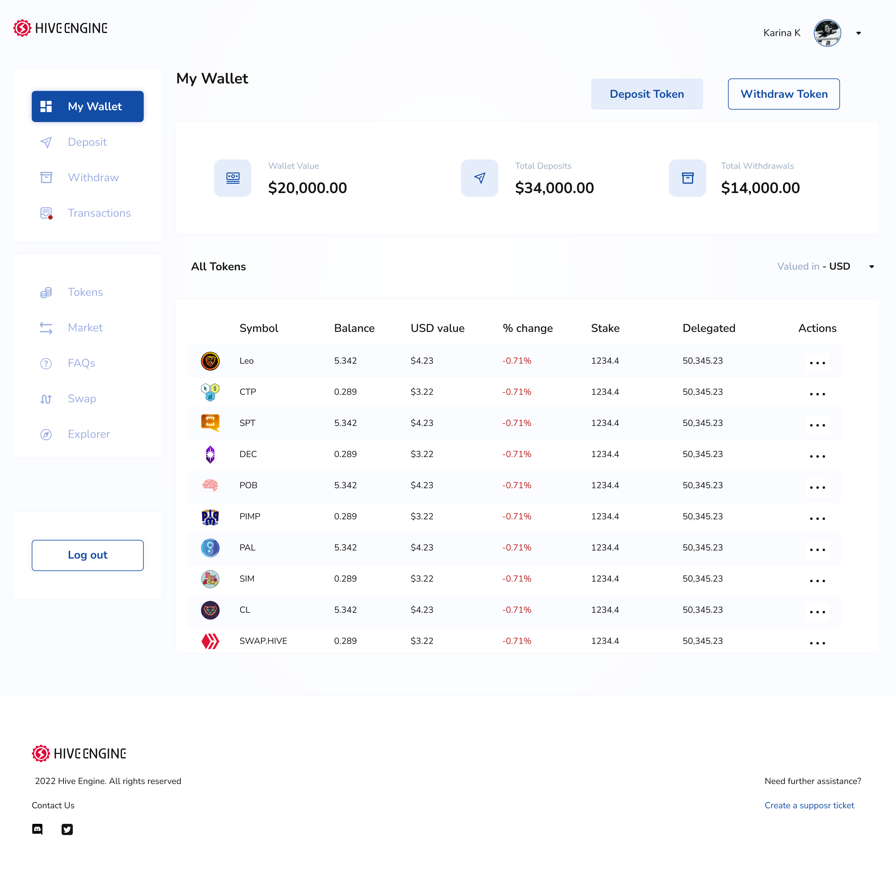
I figured the log-out button should be a little more obvious and from a recent experience I had with designing a dashboard, I figured it made sense to have the details on top at the sides.
I replaced the many action keys by the side of each token with a little drop-down key to aid accessibility and some understanding. I also named each icon so a first-timer could easily understand what they can do.
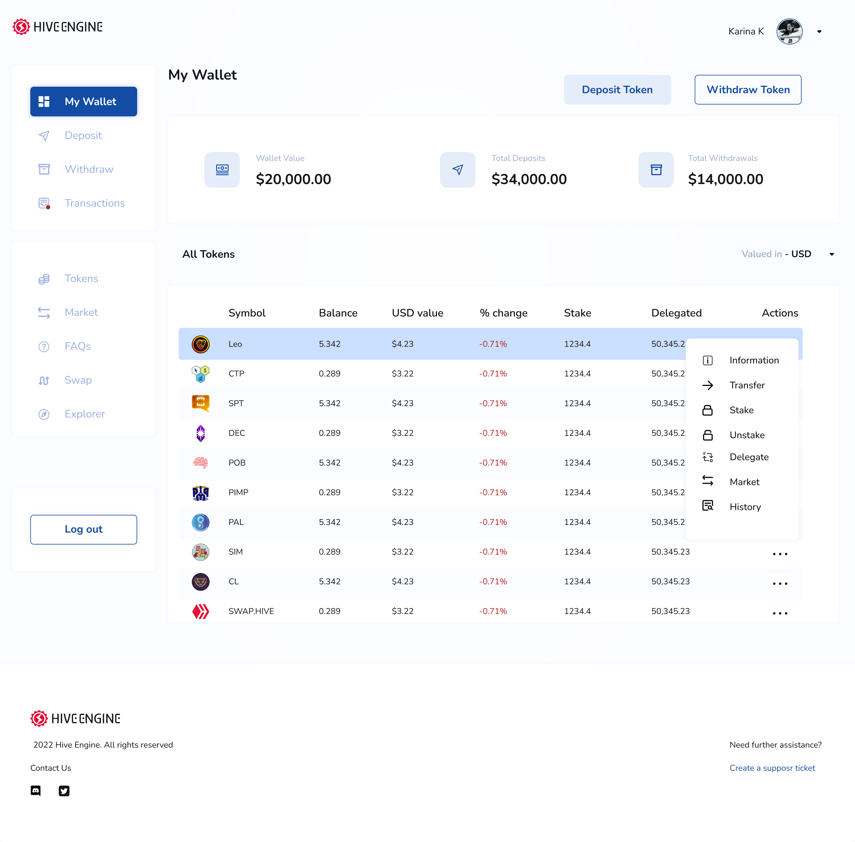
I think this way, anyone who comes across it can easily understand how to make a transaction with each token, deposit and withdraw.
It's not the greatest design. I could have made my alignments a little more dev friendly by using a proper layout and all that. But as I said, I just did it for the fun of it.
Progress Report
I've been applying for a lot of jobs over the last few days. For some, I match their criteria and for others, I don't.
I recently got matched for one and then I realised they required a 6-year experience. I felt a little intimidated at first but after checking out their website, I realised I was up for the task.
I guess having imposter syndrome is normal at this point. I'm putting in the work, I guess, so that has to count for something.
So... What do you think about my design?
PS: This redesign took me only about an hour so it's not perfect.

Posted Using LeoFinance Beta
https://twitter.com/karina_lovet/status/1559615601978515459
The rewards earned on this comment will go directly to the people sharing the post on Twitter as long as they are registered with @poshtoken. Sign up at https://hiveposh.com.