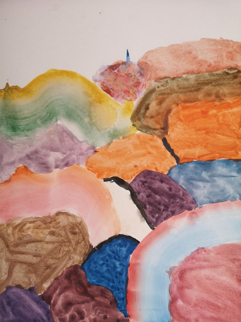
Rainbow Mountains with Kids
I came to Montreal to see my mom and learn a bit of translation and I decided to stay away from my home and hubby to take care of her during these hard times. Back a few months ago, I taught some pretty neat art classes from home to children from my community center classes.
I will give a few pointers on how to shop for paper.
Today we are going to take a look at Devon and Deon's abstract series which took a couple of weeks. I miss their bright spirits dearly and it feels right to go down memory lane.
These works presented a beautiful opportunity to work on essential watercolor techniques through formal composition.
Loading a large wet brush with different colors, being careful that they were distinct in different parts of the brush, we applied some rainbow washes. Strategic layering was used to accentuate where you can see brighter colors.
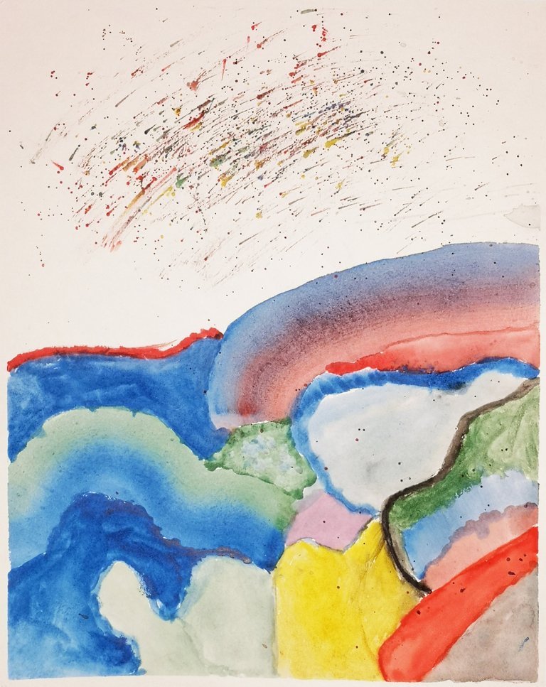
Here, the area left the white of the paper was painted in splatters which gives it a je ne sais quoi. I believe it is from the youngest, I can tell because his softness contrasts with the coral reds and it reminds me of his soft but lively personality.
I love to meditate on it.
The two of them were such artists for playing along with this more technical series where they had to push a little bit past when the thought they were done which is often the case at that age.
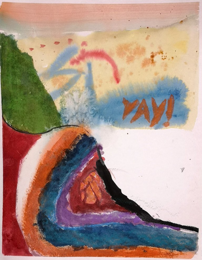
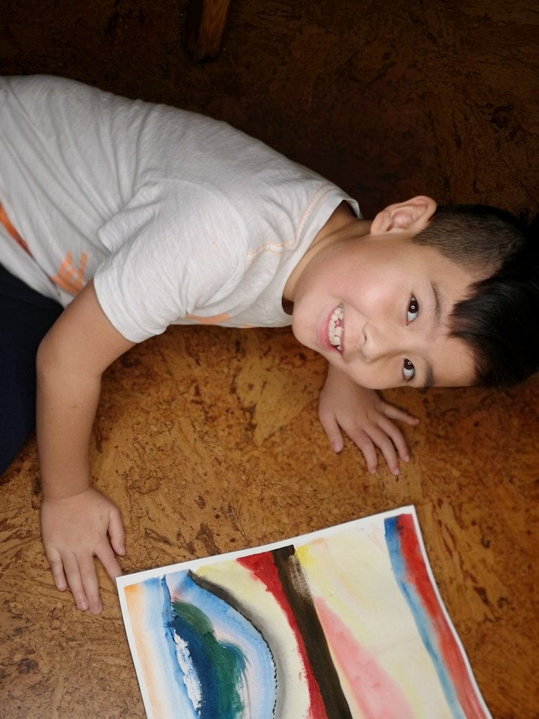
This piece explores a contrasting texture with scumbling watercolours on the mountain feature which reminds me of the Rainbow Mountains of China. The word Yay! was written with colored pencil sticks.
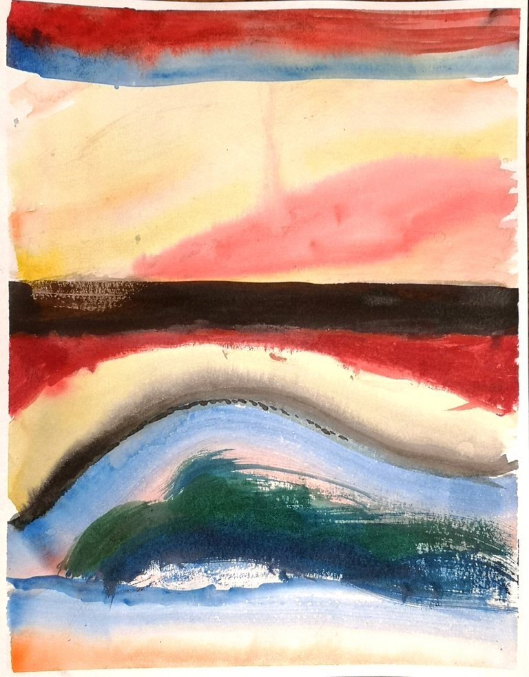
An early study from the series has the hallmarks of childhood curiosity with the adventurous wet but saturated brush strokes.
I am so grateful for the mother of these two for believing in the value of their art education and for insisting I set up these lessons when I was uncertain I could due to my busy schedule. It was a huge highlight of 2019!
Yay!
A good abstract series can emerge from simple artistic constraints such as the multi-colored brush. I hopes this inspires you to try it at home and let spontaneous compositions come to life on paper.
We used the Yarka entry level set of water colors but with quality paper by Strathmore. I advise investing in the latter if you must choose so you can wet the paper at your leisure and rough it up when needed. Note that not all 140 LBS paper is created equal as weight is but one quality needed for best results, price can be an indicator of the length of the fibre and the quality of glue within it. If a brand of paper can produce an interesting grain for their coarse paper, odds are, their smoother paper will be good quality in the same line.
Try to hone into textures and effects you find pleasing and make sure to try out a few studies so you can compare them and find your aesthetic. Try to be proud of your successes as much as possible because art is precious and life changing if you let it!
Shared to Ed's Art Circle and twitter
https://twitter.com/Suavegothe/status/1242169973528821764?s=20
Questo post è stato condiviso e votato all'interno del discord del team curatori di discovery-it Entra nella nostra community! hive-193212
This post was shared and voted inside the discord by the curators team of discovery-it. Join our community! hive-193212
This post was shared in the Curation Collective Discord community for curators, and upvoted and reblogged by the @c-squared community account after manual review.
@c-squared runs a community witness. Please consider using one of your witness votes on us here