How consumers respond to branding and identity for similar products targeting different markets | Cadbury vs Lindt case study
Consumers respond relatively predictably to a brand’s visual identity based on the choice of colour palette, fonts, visual elements and photography style used. These choices ensure the branding and visual identity designs achieve visual impact.
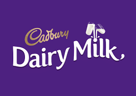
For example, Cadbury’s branding (Fig 1) present itself as being the ‘best’ choice with its colour palette – purple and gold representing royalty – but also fun and friendly with the relaxed, curvilinear lines and shapes, and fun visual illustrations. Their extended advertising campaigns are also often very quirky with catchy music. The target audience in this case is aimed at an affordable, fun, friendly and adventurous group.
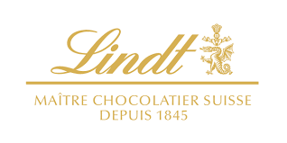
On the other hand, Lindt (Fig 2) presents itself as a more elegant and classic choice with its use of gold, italic script, intricate monogram and use of the romantic French language. The target audience in this case is a more luxe, refined and thoughtful group.
 |  |
|---|---|
| Fig 1. Cadbury's branding. | Fig 2. Lindt's branding. |
Can you think of another example of how different brands portray the same product differently to attract different target audiences?