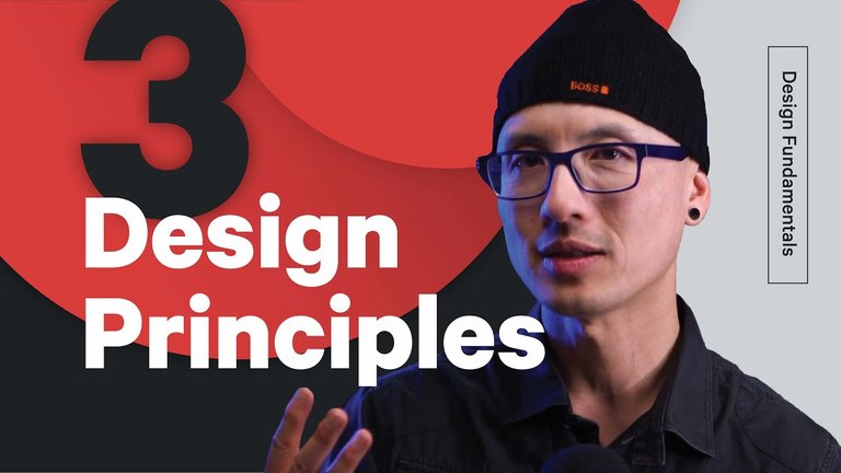
3 Principles to Improve Your Logo Design Process - Legibility, Hierarchy, and Contrast
Are you a graphic designer, web designer, package designer, or motion designer? Use these 3 Steps to Improve your design process:
Design in black and white - As we all know, Design can be frustrating, it’s easy to get overwhelmed. I find it helps to focus my attention on only whats important. That's why I design in black and white. It forces me to focus on only the most important aspects of the logo: Hierarchy, Contrast and Legibility.
Focus on legibility - Legibility is essential but can get in the way of some really fun ideas. Sometimes In purist of a clever idea, we get carried away to the point the logo becomes hard to read. Rookie mistake. The solution? Periodically check in and ask your self (or someone else) does the logo read well?
Giving a good Critique is an art - There’s much more to it than simply throwing out random opinions. Whether critiquing your own work or someone else’s, it’s important to remember that a good critique follows a process. I think of it like peeling an onion: Start by simply describing what you’re seeing. Then, say 1 thing you like and 1 thing that feels kinda funny. Then, move into what isn’t working and why. Finally, suggest ways to fix it.
These are 3 small things you can start doing that will improve your logo design skills. Getting better is a slow process, but these 3 things are a step in the right direction. We will have more tips for you soon. Keep learning stuff, one day you will be great! Thanks for watching
For logo Design:
mail me at: [email protected]
▶️ DTube
▶️ YouTube
