Funny Money from Mexico - The Bills of Change Upon Us
In the last post of my Funny Money series I talked about some beautifully designed banknotes, so let me stay with this theme, and take a look at the most recent change introduced to the Mexican legal tender. This time it's not related to monetary devaluation that had gotten out of hand, and the accumulation of endless zeros on the bills. It is rather the constant change central banks introduce to make their banknotes more secure (I guess) or at least keep the printers from getting rusty. Whether the change is for the better is a very subjective issue, and I'm not even sure where I stand on it this time.
The One Hundred Peso Bill: From Nezahualcoyotl to Sor Juana
Starting out with what is probably the most commonly circulated Mexican banknote, here is an example of the old ones and the new ones. One could argue in favor of either, but for me it's clear: the new bill can't hold a candle to the old one. It's plastic material looks like it would break before it tears, and once folded, it will keep its fold forever. Though the design kept its red theme, the face of Sor Juana Inés de la Cruz replaced that of Nezahualcoyotl, which I personally think is a sad loss. Granted Sor Juana was an important Mexican poet, composer, philosopher, and for being a 17th century nun, a surprisingly outspoken feminist.
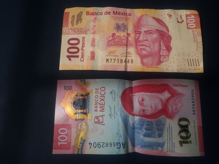
However, her face can be found on so many coins and bills, both current and historical. Lord Neza on the other hand, only on the $100 bill. Which is a pity, since he should be remembered at least as much as Sor Juana. Living just before the Spanish conquest, Nezahualcoyotl was a scholar, warrior, architect, poet and ruler of Texcoco, the neighboring nation to the Méxica empire.
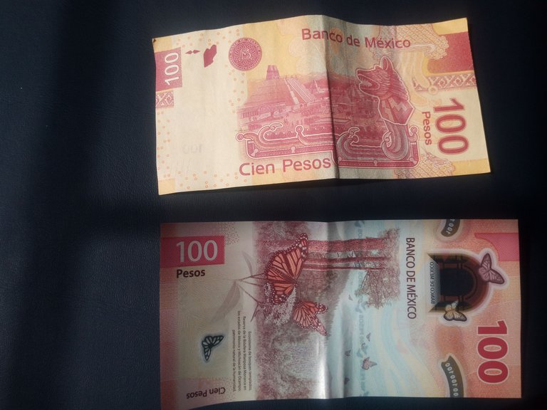
The reverse sides of the same bills feature the great pyramid in the center of pre-conquest Tenochtitlan, while the new banknote has a beautiful view of the Monarch butterfly sanctuary in Michoacán. Admittedly, I really like this image, so once again, I'm not sure whether I prefer the old or new design. However: What's up with the lengthwise view? If it was consistent, I'd say why not? But none of the other new bills follow this design!
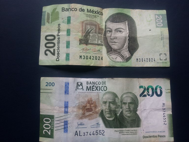
Two Hundred Pesos: From Sor Juana to the Insurgents
Like I said, Sor Juana is everywhere! Quite understandably so, and at least we don't have to worry about losing her... like it happened on the $200 banknote. Here she had to make space for not one but two of the masterminds behind the Mexican independence: Miguel Hidalgo with the bald plate and José María Morelos with his migrane towel. Since both of them are historical figures from the same period, and among the most common and well recognized faces on Mexican money, I'm kinda glad they were grouped together.
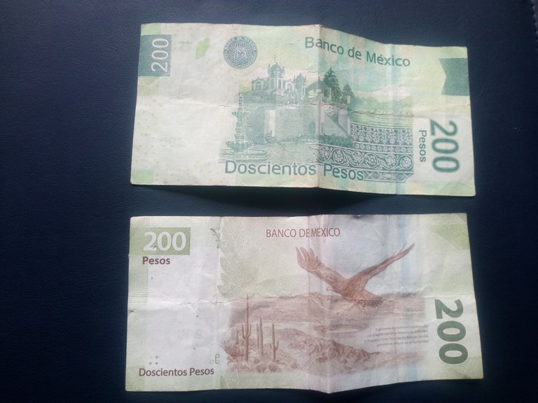
The change on the reverse is similar: Instead of the Panoayan Hacienda we get to see a landscape, probably from the northern region of Mexico. It features a soaring eagle and lots of Saguaro cacti, but all in all it looks a bit bleak. As much as I love the desert, I don't think it adds much visual beauty to the money. But that's just me. So in case of this new banknote, I must say the change was for the worse. At least they kept the green color.
Five Hundred Pesos: Goodbye Frida & Diego, Hello Benito (again)
Lastly, let's take a look at the new $500 peso banknote. This is my least favorite update! The previous large-denomination bill featured the portrait of painter Diego Rivera on the obverse side, and his partner and colleague Frida Kahlo on the reverse. There's probably little doubt that these two artist have been the most famous painters from Mexico (okay, one may argue about Diego, but Frida sure enjoys far reaching popularity). So why take them off this banknote? Who knows, especially since they are replaced with Benito Juárez.
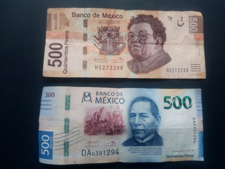
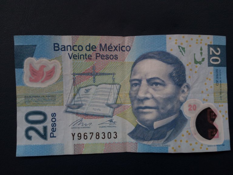
The other part about this change I consider crazy at best (and potentially deceiving at worst), is the change of color. It's interesting to note that currently the smallest denomination bill in circulation is the $20. Not only does it have Benito's face on its obverse side, it is just as blue as the $500 note!!! Without implying the worst stereotype, I really think that such a move is only setting up some potential rip-off. I already feel sorry for the clueless tourist receiving a few $20s in their stack of $500s, because the face and the color are the same. (Though, admittedly, one has to be a complete fool not to see the difference in numbers.) But then again, there is a new $20 coin out! So it may be just a matter of time before the blue $20s are phased out.
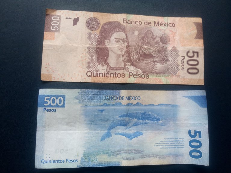
The only thing speaking in favor for the new bills, are the nature themed reverse sides: whales on the $500 bill, eagles and cacti on the $200 one, and butterflies on the $100. It's not so bad, really. However, all things considered, I still favor the old notes. I want to get my hands on some neat ones to put away before they are completely gone.
Visit the Previous Post in my Funny Money Series:
Mexico - Looking at Some Old Coins
Yugoslavia - Lots of Zeros Before the War
Czechoslovakia - The Most Beautiful Banknotes
Really ?
Really!
BTW, was this a surprised "really" 😯, a shocked "really" 😱 or a "really" of incredulity 😳 ?