color by steps
This is my process for learning and applying colors. I hope you find it helpful.
A color is made up of three parts:
- value: is it lighter or darker?
- hue: is it warmer or cooler?
- saturated or desaturated?
Any expression of a color can be created by choosing a combination of those properties.
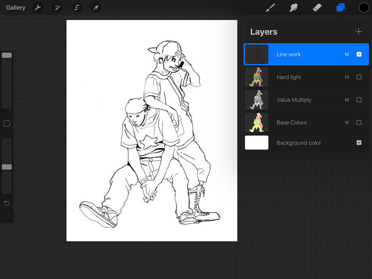
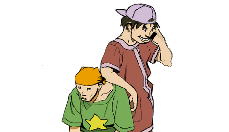
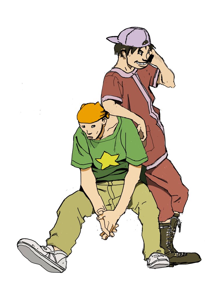
drawing
First, let's start with a drawing. Here, I made a master copy from the book Cannabis Works by Tatsuyuki Tanaka. Read this post for tips on how to create your own master copy if you want.
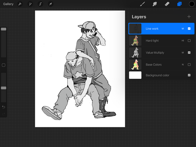
values
grays do the work.
colors take all the credit.
The most impactful element of color design is choosing the values, shades of gray, that make up the image. In here, I looked at the original artwork and guesstimated what the values are. Squinting helps, and always asking "is this lighter or darker?" If the two colors you are comparing have a similar value, they would blend into one another when you squint your eyes.
Objects that are brighter or closer to the light have higher values, as they turn away and form shadows, the values drop down.
Usually objects that are closer to us have higher contrast than objects that are further away. Contrast here refers to the difference in steps between light and dark. Things that are far away tend to have low contrast.
When working digitally, I start by choosing my lightest value first, and I paint over it, each time darkening it by 10.
As I get into details and areas that need slight separations, I begin to divide by half.
The same process applies when using gray scale markers. Paint your lightest value first, and then go over it with darker tones.
Identifying and reproducing values in an artwork is essential to learning how to color, and is the first step in becoming confident colorist.
Practice by copying values from colored work and creating gray drawings from real life. You can use digital tools or markers.
You may also use cameras to remove color from an image to help reveal the values of a picture.
In time and practice, you will become faster and more accurate in your value choices.
Somethings to notice is that some colors are naturally lighter than others. For example, yellow tends to be a high value color in its standard form, while blues and violets can have naturally dark values.
Also notice that things are rarely ever pure white or pure black, i guess unless you are observing pure energy or a black hole.
Play and vary your values to separate objects from one another, shapes that are too close in value will blend into each other and will make your image muddy. You can of course use that technique to your advantage if you are creating a low contrast image, like a far away mountain, a foggy forest. or a night scene.
Remember that the eyes are naturally drawn to high contrast, so use your lights and darks wisely to guide the eye and tell a visual story.
Don't worry if this seems overwhelming or unnatural at first, it is a skill that will get easier with time and practice.

hues
now that you got the most challenging step out of the way, this part should be fun. Pick hues that are pleasing to you. Here, I did my best to replicate the hues of the artwork I was studying. If doing a master study, I strongly advice against using a color picker to sample your colors. As that will prevent you from growing the skills needed to identify and make color choices.
You can use a color wheel and other resources to study hue harmonies to help your color choices. Observation of the world is a great way to get ideas for hue combinations.
For digital art, I use a separate layer where I lay down my hues, usually at full brightness, since the darkness of each color will be driven by the values layer you painted first. If a hue at full brightness isn't working for you, go ahead and choose a darker one.
saturation
saturated colors tend to look darker, and desaturated colors tend to look brighter.
Be careful, sometimes we may mistaken saturation for values, but they are not the same! Two opposite hues of opposite levels of saturation will still blend and merge if they have identical values. Even if they "look" contrasty.
However, you can still use saturation to your advantage. For example, to make the shadows appear darker. I increased the saturation on the skin shadow hue.
Objects with lower contrast tend to have a more desaturated hues.
I like having my pure hues on a separate layer, so I can always sample them if I need to. Also, at this stage, I place the values layer above the hues layer, set to multiply mode; this provides an idea of the final result.
If working with analog materials, I use color pencils and control the values with washes of grayscale markers. Alternating between warm and cool washes for the yellow and cool colors respectively. I hope to do a demo of that in future posts. But first, let's finish this!
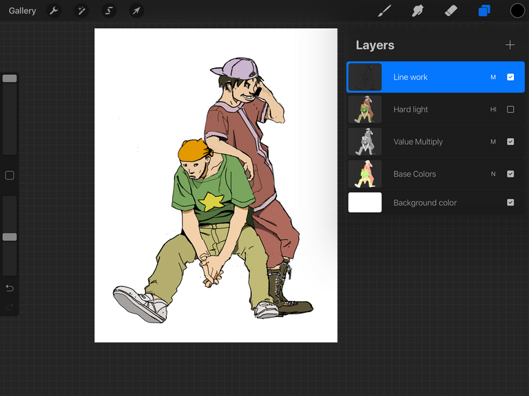
blend
Place the values layer above the hue layer and set it to Multiply blend mode.
This step may desaturate the entire image and lower its vibrancy and contrast. To balance that effect, add a contrast and/ or a vibrance adjustment layer. Here, I duplicated the hues and value layers, merged them, then set their blend mode to Soft Light at an opacity of 40%.
and that's it!
color pallets and beyond
when creating colors, keep notes, like recipes. So next time you can create those colors you searched for much quicker. If working digitally, it may be a good idea to save and organize your pallets. My hope, at least for my process, that in the future after much practice I will know just which exact color to pick. Remember, a color is made up of value, hue, and saturation!
Until then, keep creating!
According to the Bible, Why is there death if there is God? (Part 1 of 3)
(Sorry for sending this comment. We are not looking for our self profit, our intentions is to preach the words of God in any means possible.)
Comment what you understand of our Youtube Video to receive our full votes. We have 30,000 #SteemPower. It's our little way to Thank you, our beloved friend.
Check our Discord Chat
Join our Official Community: https://beta.steemit.com/trending/hive-182074
This is SO FRIKING AMAZING!!! Thank you so much for breaking it down to the smallest process bits. I just read through it super fast but I’m saving it so I can come back to it.
Pure gold 🔥
Posted using Partiko iOS
Thanks @eyedrip! I'm glad! I hope you find this useful. Hit me up with any questions or feedback! ✌🏼
Congratulations @nidalo.art! You have completed the following achievement on the Steem blockchain and have been rewarded with new badge(s) :
You can view your badges on your Steem Board and compare to others on the Steem Ranking
If you no longer want to receive notifications, reply to this comment with the word
STOPVote for @Steemitboard as a witness to get one more award and increased upvotes!
You have been curated by @ewkaw on behalf of Inner Blocks: a community encouraging first hand content, with each individual living their best life, and being responsible for their own well being. #innerblocks Check it out at @innerblocks for the latest information and community updates, or to show your support via delegation.
Good work, @nidalo.art, you really should do an #introducemyself post.
I agree!!
Posted using Partiko iOS
Congratulations @nidalo.art!
Your post was mentioned in the Steem Hit Parade for newcomers in the following categories: