Charts of the Day - Trading Journal (08.07.20)
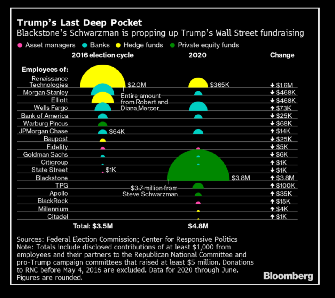
First chart is showing the amount employees in public firms that have donated to the president. Note Blackstone donated the most at $3.8 Million and they were recipients of trading the government's assets in the first Covid relief bill. Try not saying conflict of interest happening here? A bank that owns stocks is hired by the government to invest government money into stocks. Why would Blackrock not be the one that donates the most to the president? Duh!
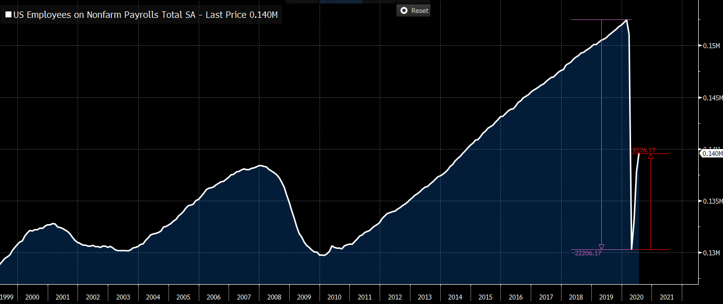
Chart of the latest employment rate and it is showing that employment is slowly improving. Time will tell how quickly this recovery really will be for main street but as of now it is lagging behind the stock market by miles.
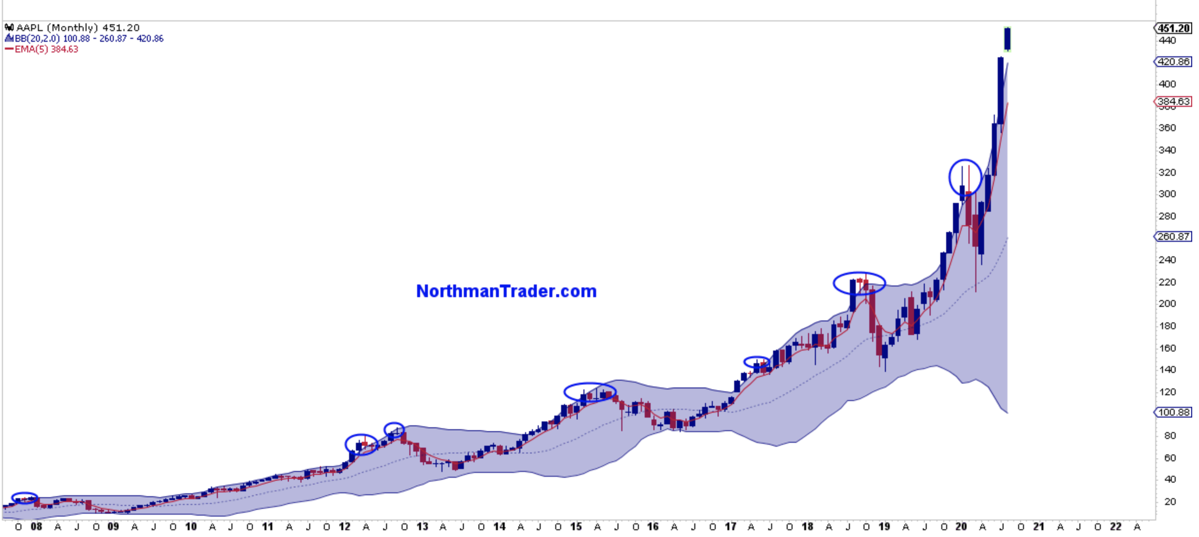
Someone I followed, Northmantrader, on twitter posted the extend FOMO in Apple. Stock is outside its bollinger band and is still continue to rise. Sooner than later at the very least there should be some sort of price retracement.
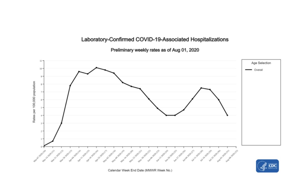
Even though news outlets are still talking about Covid's spreading the real numbers are showing that there have been a continuous steady decline in cases. This is a good sign that things are getting better instead of getting worse. A good chart to see and hopefully the trend continues indefinitely.
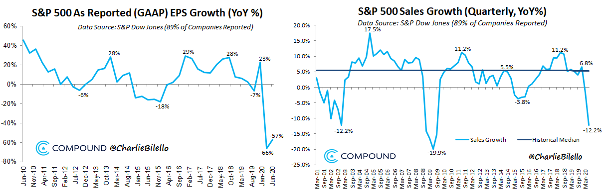
So most companies have released their earnings and over 80% of them had beaten expectations. The caveat to the beats were they were lower prior to earning released. As the chart shows on average a company had growth declining. Yet here the markets is literally less than 5 points from its all time highs in regards to the SPY.
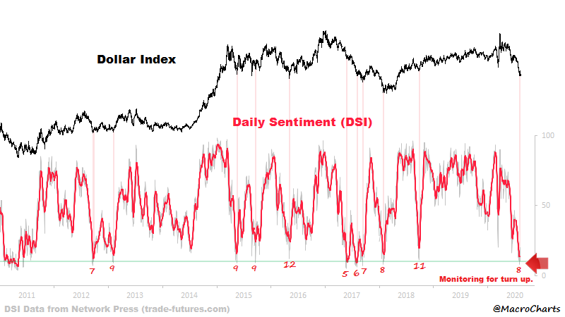
I have been following the dollar and this chart is showing there maybe a bounce in it very soon. This has inversely correlated with the current market very well. The higher the stock prices the lower the dollar and vise versa. Will continue to keep an eye to see if indeed the dollar reverses which is a sign markets may drop.
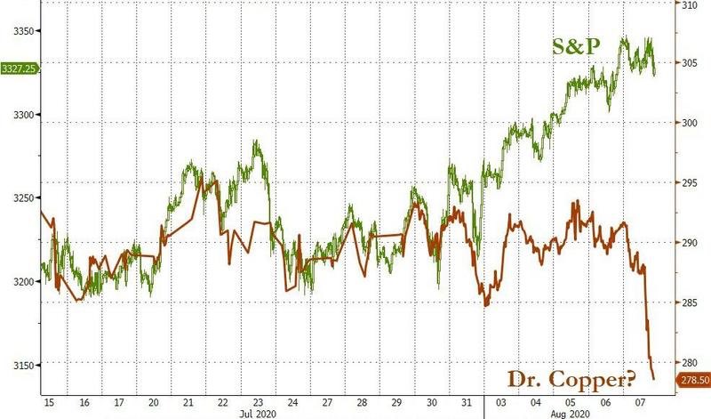
Another chart with correlation of the SPY with copper. Note today copper prices dropped significantly yet SPY closed green. The correlation between the two assets were not that far apart before July so a reversing will have to occur. I think it will happen soon since there had been even wider spread between the two asset prices as of close of today.
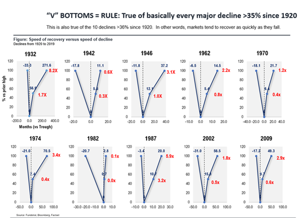
This last chart is illustration of every market drop over 35% from its highs and how long it took to reach back to that specific high. Interestingly enough all but two times did it take less than 5 years to reach back to all time highs. Odds are likely that the current one will also be swift as a repeat SPY is less than five points from reaching back to all time highs and this current stock price recovery started in April. So less than 6 months for it to get back to high is definitely remarkable.

Posted Using LeoFinance