Photoshop Practise and Colour Grading

If I'm not looking at images, I'm shooting them, and if I'm not shooting I'm finding inspiration and planning, and if I'm not doing that I'm doing Photoshop. There is more to learn in every aspect of photography and it never gets boring when you just keep switching between different areas. Today was a Photoshop kind of day. I've gotten pretty good at skin retouching, so next up is colour, my achilles heel fo sure.
You might have noticed that the majority of my human photography is in black and white, and it's not that I don't like colour, it's just that colour is very very very difficult to do well. With black and white, all you need to concern yourself is with light, shadow and shapes, but with colour, there is a whole other level of things to take into account. When shooting colour, you need to make sure everything in your scene matches, from skin tone, to background, clothing and the colour of light. That is very difficult and requires lots of planning, which I am not great at.
You don't have to actually get everything perfect, but into a fairly good range of colours, that you can then adjust in post process. Colour grading is very difficult and I suck at it. There are different tools your can use, often a combination of them, and masking out different parts and all the adjustments have to be done quite delicately so you won't end up with something unnatural. Of course you also have to have a great eye for colour and be educated in colour theory, AND develop your own style. pfffssshh. I'd say I have a pretty good eye for colour, but knowing exactly what I want of my image and translating that into the photo is something I need to work on.
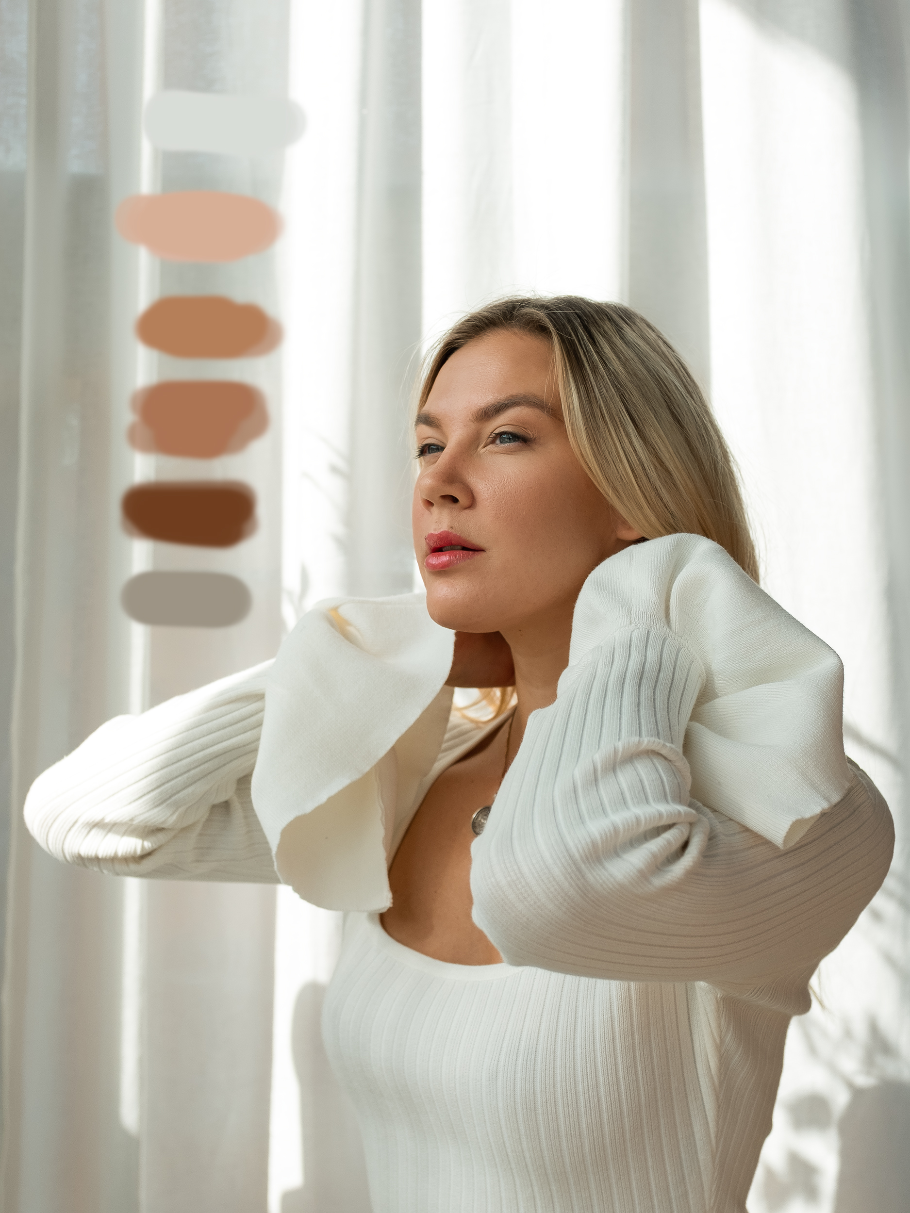
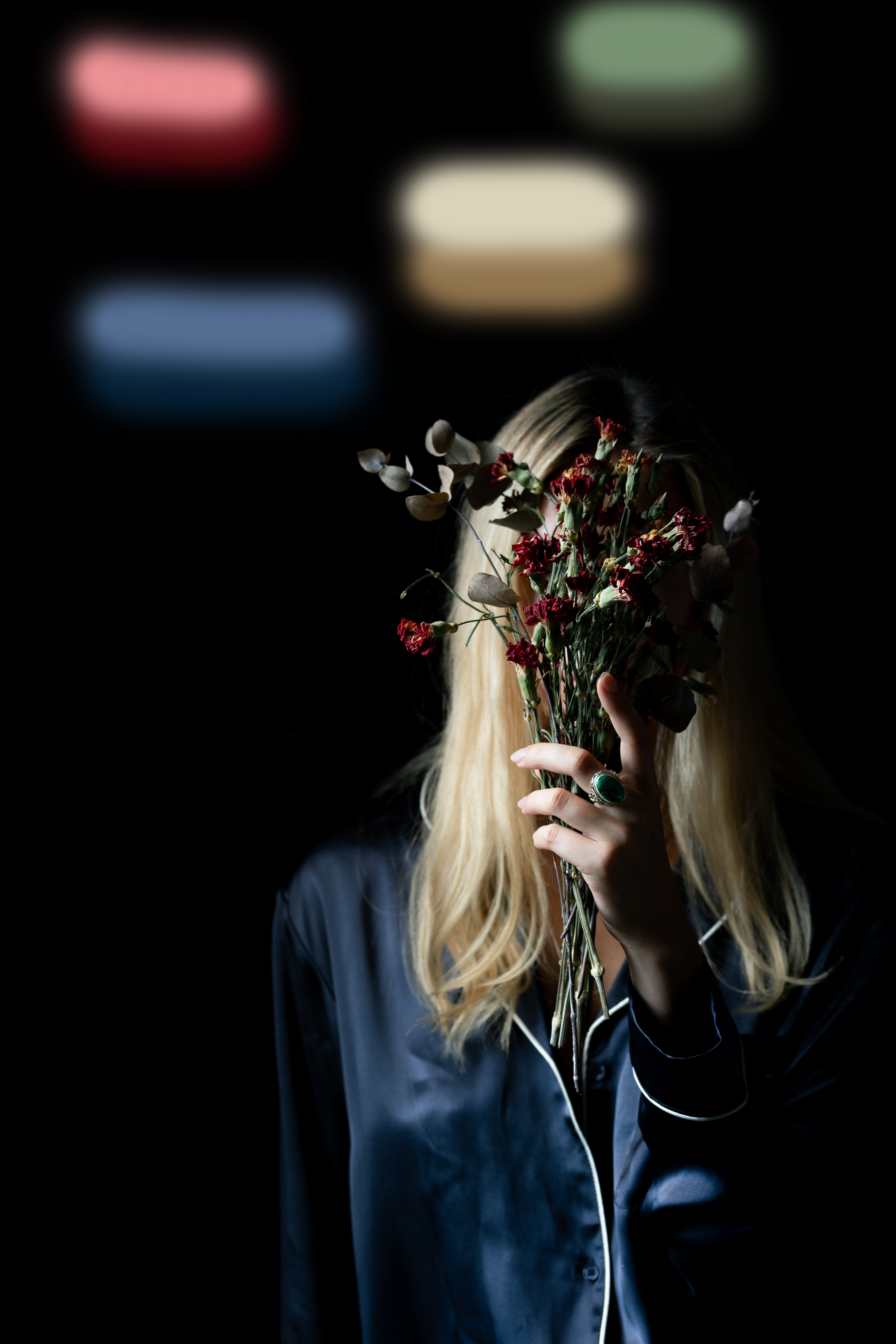
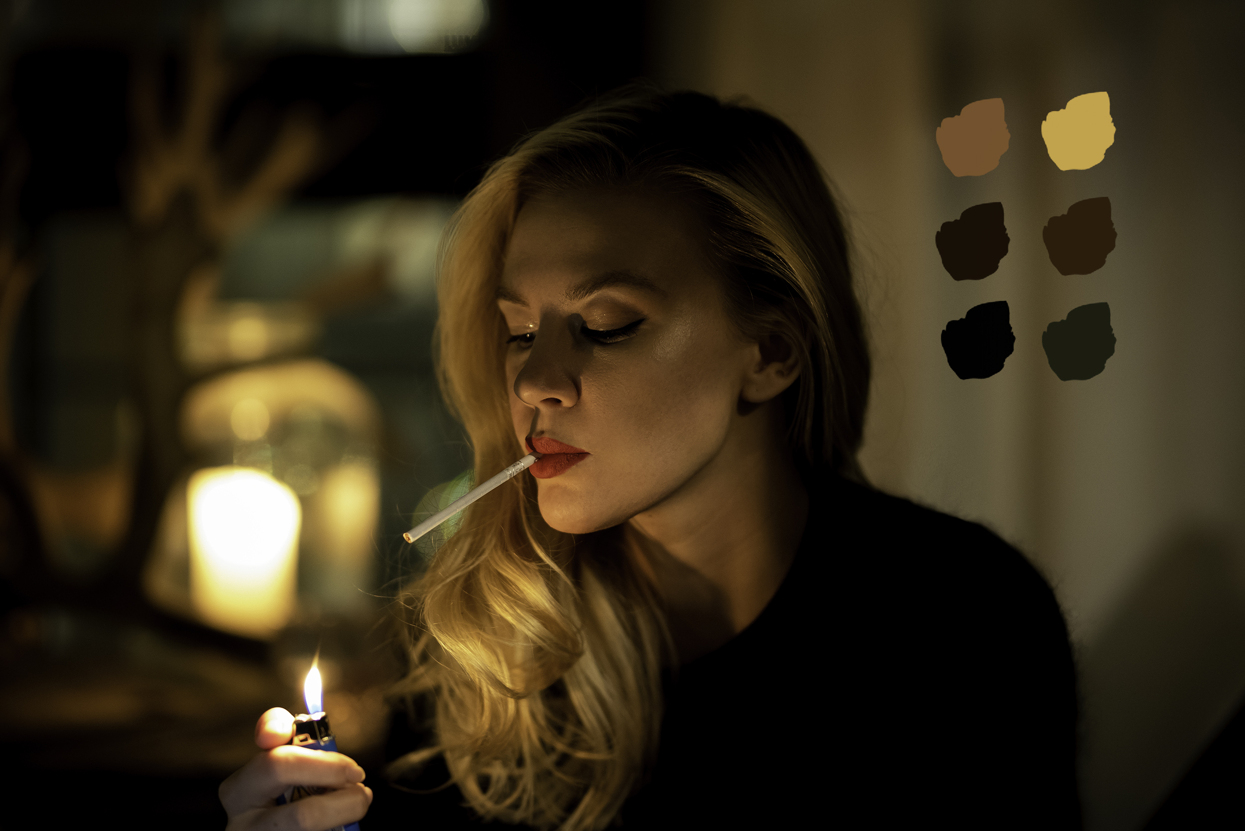
I've spend all evening looking at different tutorials related to colour grading on Youtube, trying them out, and looking at great pictures from some of the fashion photographers I admire whose images are really nicely coloured. I didn't actually get anything done properly, but I tried different images and played with the tools. I found it quite helpful to sample colours from the image to see if they make up a harmonious combination after I've adjusted the image. Or find a suitable set of colours as inspiration to try and adjust my image to match it.
Colour grading is at the top of the list in my Photoshop practise in the near future. Pray for my little brain cells and retinas, they working hard over here. OR I could just slap on a readymade filter, right right?


The last image have a crisp warm cinematic grading that is mesmerising.
I feel I know what you are trying to get with the second image that has flower and blurred colours.
Checkout: coolors It generates harmonious colour palette using sample colours from your image/work.
That looks like a really useful tool, thanks!
You got that mug working pretty good in that first pic. 🙄
Trial and error, trial and error.
Trial and error for you...If it was my mug...Trial and horror. :)
There's that wonderful lighting again ❤️. I love how you've worked along with the glow from that lighter, for what seem to be an obscenely long cigarette!